Typophile

Diving Logotype

jayyy

Just looking for a few quick opinions and critiques on this. It's a logotype for a diving school and is aimed at beginner scuba divers. The project is a very small web project for which the client needed an identity too. Budget is tiny (mainly for web part), so have no room for multiple iterations and variants.

Thanks in advance!
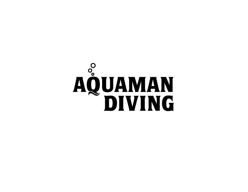
I'm not sure you need the bubbles AND the wave. But if you keep both, perhaps the bubbles could be placed elsewhere. The Q seems to be getting too much focus.

It did cross my mind Darrel. I kinda see some similarity with the 'Q' and an old divers' helmet though

ah! Diving helmet! I did not see that! But now that you mention it I like the idea.

Yes, the diving helmet thing is interesting, but then I’ll second Darrel’s advice about the wave being redundant (and it reminds me more of toothpaste than of diving ;-)

What if instead of using the regular counter in the Q you swap it out for a gridded circle to make it more of a literal diving helmet:

http://ak1.ostkcdn.com/images/products/P915955.jpg

I got the helmet thing, which made me feel like it was a bit more serious diving, rather than casual/leisure diving, but the name seems playful enough to go the other way.

Maybe it is my taste, but I often like to see the subtitle in a complimentary font, in this case simpler sans a bit smaller, but still echoing the overall structure of the main font.

As for the bubbles, they feel too geometric or something. Have you tried to make the bubbles form the counter of the Q? or even just try them as solid circles instead of outlined? Not sure, but you are close to something very nice considering the time and budget. Good stuff!

I like it, but it needs tweaking. I didn't see it as a helmet at first, I just saw waves and bubbles as 2 separate graphic elements, which seemed a little redundant. The bubbles should stay, but maybe if you made the rest of the Q look more like a helmet, instead of a Q with a wave, it would work better.

I agree,

Making the helmet more helmet-like and maybe do something with the window of the helmet.

Gr Jeroen

There is also this: https://www.aquaamerica.com

Captured from web.archive.org on 4 Aug 2014. view this capture