Typophile

Web fonts, the executive summary

Alex Pankratov

After much experimentation with trying to use "webfonts" for production quality consistent looking website designs, here is the best practice guideline I have converged to. For anything larger than 16px in font-size:
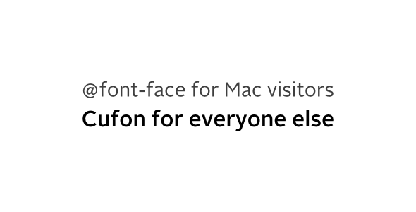
If it were not for the pinch zooming on iOS devices, it would've been Cufon all the way.

--

If you sell font licenses for the web usage, please please make them Cufon friendly. No self-respecting pirate will ever care to convert obscured Javascript outlines back into mangled OTFs, when it is far easier to find the originals on torrent sites. But having a Cufon option will make the fonts far more attractive and useful to the web designers.

If you are set on a service business model with recurrent charges, consider offering Cufon .js the same way you currently offer @font-face files. In the end this is not about paying less or more, it is about having a website look the same on all platforms. Something that is currently impossible to do with just the @font-face.

Hey pank, I'm a Cufon fan, too.
But why not @font-face for Mac and Flash Replacement for everyone else?

And I think there is much, much less concern these days for consistent appearance from device to device, browser to browser. Half the time, it seems like nobody tests further than Safari on Mac.
Anyway, embracing and delighting in the differences is going to make for greater happiness. Learn to love ugly - I'm amazed at how forgiving people seem to be about it when it comes to fonts.

Cufon is not a Flash Replacement, that would be SiFR. The reason for @font-face on Macs is the zooming being a common browsing pattern on Apple mobile devices. Pre-rasterized text looks pixelated when it is zoomed on.

And please don't mangle my username, Richard.

Well, at least he didn't use my first reading of your nick: spankrat.

@Richard: He who has Flash, has Javascript. Vice versa is not guaranteed. Were this site not so Flash-bound, I would likely have tossed Flash out already.

"it is about having a website look the same on all platforms"

That's been a long asked for thing from folks but that's just not what the web is about. The best way to describe it is that web design is about suggesting a design...rather than controlling it.

That said, yea, Web font rendering still has a way to go on many platforms, so I don't blame you for switching to Cufon.

No Cufon is not a kind of Flash Replacement and I didn't mean to suggest that it was. (Did I?)

And gee, so touchy on the username! Sorry if my playfulness offended you.
Me, you can mangle Richard Fink any way you want. With a last name like Fink - and especially for someone who grew up in an era when the word still saw quite a bit of usage - learning to take such things in stride prevented many a black eye in the schoolyard.
And hey, check out House Industries Rat Fink fonts! Very cool.

Cheers,

rich

> No Cufon is not a kind of Flash Replacement and I didn't mean to suggest that it was.

Oh. I missed not in your question, my bad. The main problem with SiFR is the Flash dependency, especially considering the proliferation of FlashBlock and similar plugins.

--

I am mulling over writing a replacement rendering engine for Cufon that would outsource the rasterization to the web server. In other words when it would come to actually drawing text on the canvas, it would instead talk to a web server, have it draw that text into a .png instead and then fetch and display the resulting image. Basically a form of FLIR that works as a drop-in replacement for Cufon.

If I am to take the idea a bit further, this could actually be wrapped in a service run by the foundries themselves. And under the very same recurrent billing model used for @font-face licensing.

--

@Darrel - I should've said "looking good across all platforms" rather than "the same". Not achievable with @font-face in larger sizes at the moment as I'm sure you know.

the server-side image rendering method has been used in the past. The main objection to it is bandwidth...you're slowing the site down having to fetch images for all the text. Not the best user experience. You also then run into client side problems with text resizing and such.

And I agree...the 'looking good' across platforms isn't quite there yet with web fonts.

> For anything larger than 16px in font-size

What about 16 and smaller?

> If it were not for the pinch zooming on iOS devices

1) Other devices are getting that too.
2) Might there be a way to disable it, at least in an app?

> it is about having a website look the same on all platforms.

How important is this really? But I do agree that: it should look stylistically appropriate and readable on any platform, and at least at small sizes onscreen that can come darn close to meaning "consistent".

> Learn to love ugly

Uh, no.

--

I agree that Flash dependency is non-ideal. But to me Flashophobia is much worse, especially when a developer falls for a shiny corporation's thinly-veiled excuse for Making More Money.

hhp

I assume that's meant as a slight against Apple, but that's exactly what Flash is. Adobe's thinly-veiled excuse for Making More Money. ;o)

Flashophobia would be an irrational fear of using flash. While that probably exists, there are plenty of rational objective reasons to avoid flash (many of them due to Adobe's perpetual laziness).

Flash isn't veiled - it's simply a product that many developers have adopted and continue to support. It's a bit different when a company does not want to admit that instability is not the real reason Flash isn't supported on [some of] their products. Screens that break too easily, batteries you can't change on your own, these are all part of the disturbing picture.

And the main reason some developers are anti-Flash now is that they're emotionally attached to a brand, not least because they are also emotional users of "cool" gadgetry. Their consumerist loyalties overpower their pragmatism.

Personally, I'll take lazy over dishonest any day. And I'll take a company that cares about type over a company that ignores hinting and produced a Comic Sans clone.

hhp

My main interest in web fonts would be to allow me to use an open-source face, so as to avoid issues, which would allow me to present a web page in a popular type style not available as a standard font.

Using @font-face, except for the fact that one needs to do it differently for different browsers, is probably better.

Anyways, I experimented with it. TeX Gyre Schola worked perfectly. Goudy Bookletter 1911, however, crashed it. That face has some coding issues, and points are missing at extrema according to FontForge, so the fault likely lies in the font and not Cufon.

... the good news (from my perspective) is that Linden Hill, from the same source, works.

Of course, Cufon has serious limitations. CSS has to be used for leading - that isn't really a limitation, except that CSS is slightly more awkward to use with it. But the big limitation is that you can't have it substitute multiple fonts, giving each font certain tags - although there's a workaround involving a fancy JavaScript utility that turns various scripts on and off.

The fact that the technique it uses means that people have to "view source" to copy text off the page... that will annoy people, and start some on their first step to becoming hackers. For some content, of course, it's largely irrelevant.

Of course, for an open-source font, embedding is not required, and so @font-face probably is the right way to go for most purposes.

That lasst point, the barrier to text accessibility with Cufon, is what makes me hate it. (For most uses, anyway.)

Discrepancy between Mac users & the rest of the world is stupid.

On Windows, DirectWrite & Gdipp (http://code.google.com/p/gdipp/) are not made for dogs.

On GNU/Linux, Gnome 2.30 has a very good rendering.

Mac users are not the computing elite, just perhaps some Apple yummy sluts (including myself when I use my iMac ;-))

"Screens that break too easily, batteries you can't change on your own, these are all part of the disturbing picture."

That a little tinfoil-hatish implying some proprietary scheme on Apple's part. OK, that's all fine and dandy, but Flash is proprietary Adobe. You're arguing for one using the same argument to argue against the other.

The reason people chose not to use Flash isn't due to some Apple kool aid. It's due to decisions Adobe has made. Apple choosing to not use proprietary web plugins in their mobile browser just sped things along a bit.

You're confounding everything, and ignoring my main point.
I'm sorry if this is harsh, but: I don't argue with fanatics.

hhp

"I'm sorry if this is harsh, but: I don't argue with fanatics."

It's not harsh. But it's ironic when you say it. You seem fanatically anti-apple.

Hrant, you’re starting to sound just like one.

I admit to being fanatical about some things. In this context about corporations that go too far in usurping the gullibility of consumers, while making "we're the good guys" a central part of their image - that's a bit much! Of course any corporation tries to make money, and cannot be totally honest, but different companies have different business ethos, and to me some of them are simply too far from common decency to be tolerated, no matter how shiny and friendly their products are. Really, being fanatically pro a corporation is much worse than being anti. It's not like I'm fanatical about MS, Google, or any of the handful of corporations that I think are doing some good, socially responsible work.

BTW, the way I see Apple now is exactly how I used to see MS in the 90s. On the other hand, even back then MS used to care about type, while Apple hasn't cared for many years now - and frankly I don't grasp how this sad reality can be glossed over by people on a forum that's fanatical about type.

hhp

In the context of web type, though, I'm not sure what Apple is ignoring. Granted, I likely don't have the same eye as you do, but web fonts look pretty good to me on iOS.

Is Adobe paying more attention to type? Well, I hope so. They sell fonts. I hope Android, OSX and Windows do more as well.

http://code.google.com/p/gdipp/
Thank you, thank you so much for this link! FreeType on Windows, my eyes have been waiting for a change for a long time. Well I've tried the previous version, gdi++, but it wasn't stable enough.

Captured from web.archive.org on 23 Jan 2015. view this capture