
Hello,
If anyone have some lay-out tips on this logo than let me know.
Thanks in advance.
Hello,
If anyone have some lay-out tips on this logo than let me know.
Thanks in advance.

Spacing need some tuning (especially the huge gap between "of" and "jazz").
Thank you Riccard for your advice,
For example, I see now the space between the 'J' and 'A' need also some closer kerning next to some other very little adjustments in the words.
Gr Jeroen

It strikes me as the center of a vinyl record. If so, it might be interesting to try use the 'o' as the hole in the center of the record.
I really like the concept, but the type needs some adjusting - maybe some different fonts and maybe some resizing and layout changes.
Thanks for the advice,
Don't think the 'o' can get in the middle. I tried a lot of fonts out that were used on jazz albums of the 60's/70's.
If anyone have some font tips?
You could be right about the layout and font (resize) change.
Thanks!
I tried a lot of (jazz like) fonts but I still find it hard to design straight lines in a round logo.
It just doesn't look as nice as I would like it to be.
I did some type-on-circle-typesetting in some previous versions of the logo but my client prefers straight lines of type.
Any advice?
I still find it hard to design straight lines in a round logo.
You should aim toward contrast:

The design of No. 157 says old to me, not new. I think you're on the right track with No. 162. The mix of caps and lowercase, of wide and condensed, of serif and sans, are the visual equivalent of swinging improvisational music.
Having all the lines justifed feels wrong, though, like you're playing on the beat when you should be syncopating. How would it look if you moved MESSENGERS a little to the right and OF JAZZ a little to the left?
I personally would tighten up the linespacing a tiny bit, but that's just my own preference in a headline with no descenders.
Thanks for the advice.
After tying some other Giza Fonts and buying the ones I now design with, I altered the logo.
It still need some tweaking of maybe a redesign. I'm not yet totally happy with it appearance.
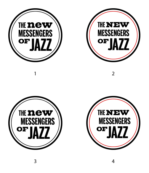

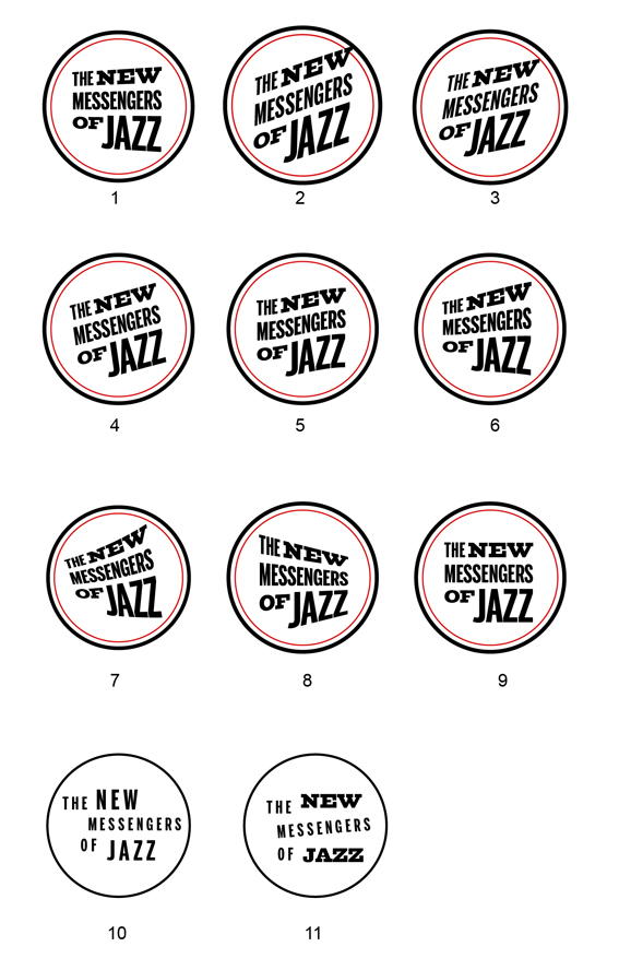
#2 for me. But I'd loose the inner stroke and inverse it - so it ll be white text on black circle.

Nice work. I agree with what Sebastian said. #3 and #4 lose a lot of tension and coherence IMO – I'd definitely keep the text block.
Also, I think I'd nudge the entire text block a little bit to the left, and *maybe* also up a tiny bit. And to my eye the "JA" in "JAZZ" is too tight now.
Thanks for the advice and the complement.
I haven't done the kerning yet while working on the layout.
No. 2 is also my favorite but it's still a little 'uncommon' maybe.
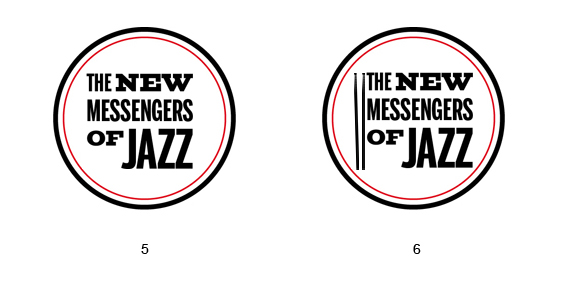
I have put the textblock in /5/ more to the left site but it looks a little out of balance.
On /6/ I've put some drumsticks.
Hello,
Anybody some extra advice?
Thanks in advance.
gr Jeroen

I think 1 and 2 are good (2 a bit better?). But if you're doing away with the text block, why not try to make the text fit nicer inside the circle?
Thanks for the advice Vilbel.
I'll take two for now, I'm looking for a better solution, see the post on my blog:
http://jeroenboselie.blogspot.com/2011/06/jazz-logo.html
gr Jeroen

Hi Jeroen,
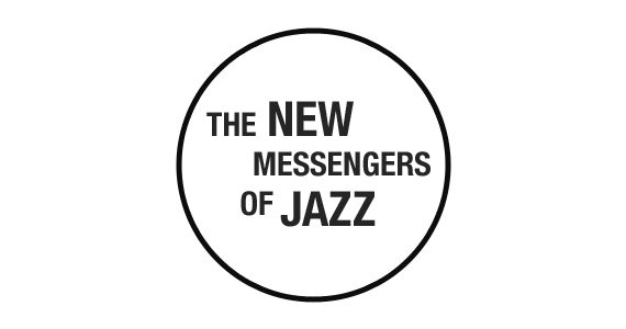
Maybe this works? The concept is to balance left and right.
Thanks for the advice Tim!
Here are some examples:
This should be the final piece, maybe some closer kerning between the /F/ and /J/.
Any critics?
Gr Jeroen

Hoi Jeroen,
Ik denk dat ik je horizontale spatiëring wat krap vind. Zeker ten opzichte van de lijnhoogte.
De letter compositie vind ik wel mooi alhoewel het misschien wat minder jazzy word door de 'sterke eenheid'.
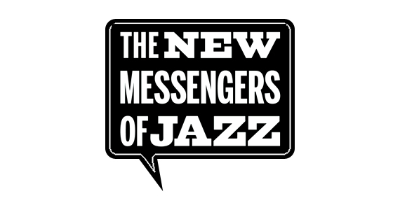
Misschien werkt een andere omkadering beter dan een circel. Ik denk gelijk aan een vierkante spreek bubbel aangezien het om messengers gaat!
Voorbeeld is onderweg.
Gr. Tim
(Excuse me for the Dutch people. I can explain myself better that way.)
Quick PS sketch.
Hello Tim,
Thanks for the example. It looks good.
Horizontal spacing = tracking I guess.
Putting the text in the circle is a harder thing to do.
Gr Jeroen
Yeah tracking.
I know :-) Does the client or you insist on a circle? The above solutions is just so obvious and memorable. And i bet it would look great on a album cover too!
Captured from web.archive.org on 5 Aug 2014. view this capture