
Hi Typophile,
There is a logotype designed by Fabio Ongarato Design for the The Capitol which feels like it has been inspired a bit too much by another custom typeface—Twin by Mark El-Khatib.
The logotype

Twin
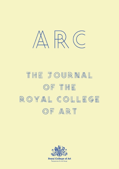
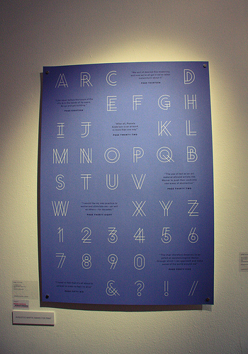
I guess conceptually this kind of double-line typeface isn't new, it's been popular probably since the letraset types of the '70s but visually Mark El-Khatib's typeface is quite distinct, the way the lines loop and cross over is something pretty unique in the canon of contemporary type design isn't it? The designer has tried to change it, however, in the text South Yarra it's quite clear there is a big relationship between the logotype and Twin.
What are you opinions fellow typophiles? Is this plagiarism? Or inspiration?
| Attachment | Size |
|---|---|
| ARC_PRESSRELEASE.jpg | 40 KB |
| 4760275401_66d5e59abf.jpg | 156.69 KB |
| Untitled-1.jpg | 35.73 KB |

