Hi everybody,
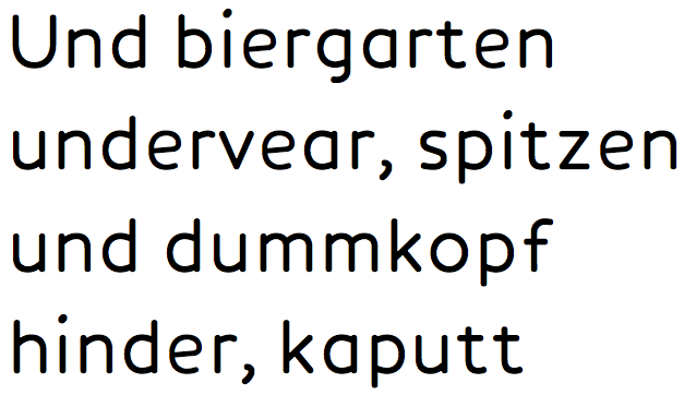
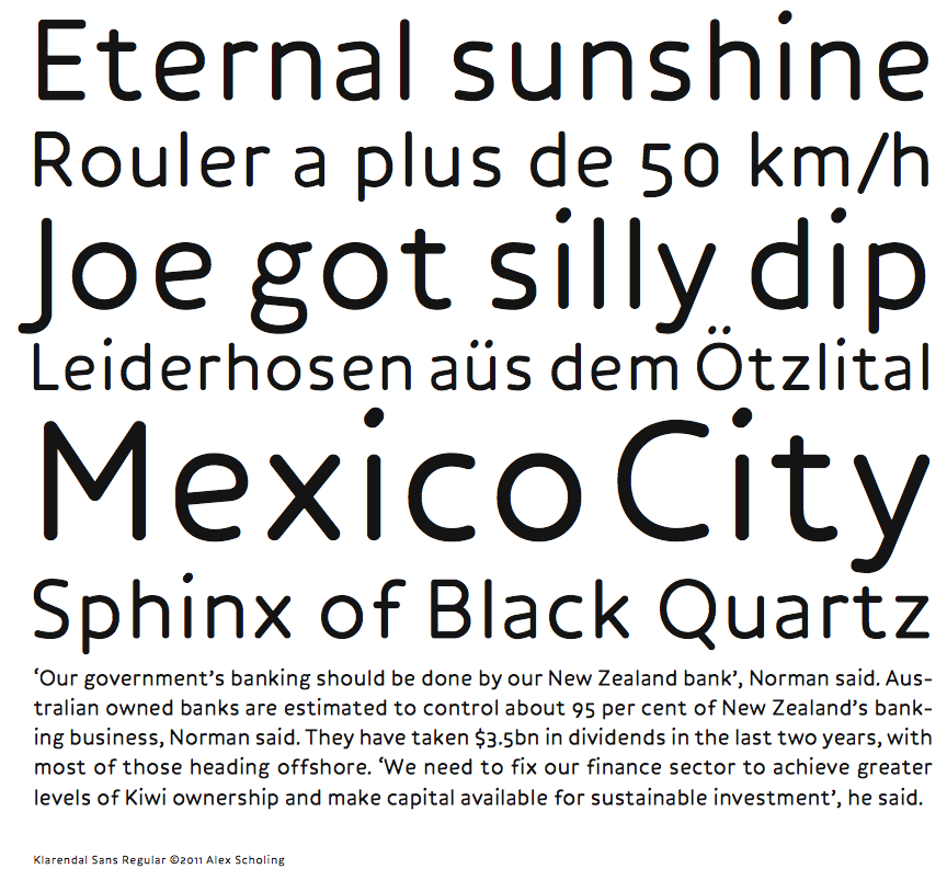
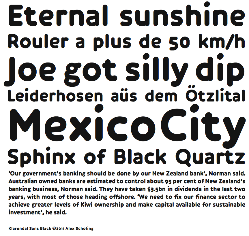
Below are a few samples of the font family that I am working on right now: Klarendal Sans, named after the neighbourhood in which I live.
Klarendal Sans is based on a typeface that I finished about a decade ago - FF Roice - which in turn was based on a typeface I made almost a decade before that, FF Engine.
You could say that I am addicted to rounded monoline typefaces and Klarendal Sans is no exception. I love the barebone clarity of having no contrast and it allows me to focus entirely on the baseform of characters - the skeleton - which seems to fascinate me to no end.
When I first made Engine I faced some challenges.
First, I wanted to make a textface without the hallmark feature of all typefaces and especially textfaces: contrast. Contrast allows for the balancing of the whites and blacks of a character wherever needed, to produce a nice and even fabric of text on a page. So contrast is good. But still, I wanted no contrast, not even low contrast like let’s say Futura. I wanted nothing, zero, nada.
Second, I was a type lover but definitely no type designer.
Third, I like unconventional stuff, which in general doesn’t go well with reading, which as some of you may know, is based on rather a lot of convention ;-)
Long story short, I did it, but it was clearly the quirky work of a hard working novice (though it actually reads quite well). So then I decided to make Roice, which was still quirky but much better proportioned.
And now here’s Klarendal Sans, well almost. It’s like Roice, but without the quirks, and sans the serif-like bulges. Proportioning is also a bit different and ascenders and descenders are very short. And finally, the light and black weight are farther apart in weight but closer together in size.
With Klarendal Sans again being a monoline I still have to deal with the fact that black/white balancing has to come from the baseform and not from contrast, which becomes more and more problematic as weight increases, and I have to admit it: it still can’t be done without cheating. Where necessary I reduced the weight of entire glyphs or increased the size of the counters, or both, while trying to maintain the monoline feel.
I’m still fiddling with weightcorrections and spacing, but so far I find the result quite okay. I wonder what all you type afficionados think of it, being what it is, a still fairly unconventional solution to a still very conventional task: reading.
Thanks, Alex
| Attachment | Size |
|---|---|
| KlarendalSans.pdf | 85.48 KB |