Typophile

Logo Critique

alienbreed

I Would like to hear some feedback in this logo design. The mark says "Al Qasr in Arabic which means The Palace in english. I'm not quite sure if I did the calligraphy just fine as my knowledge in Arabic language is close to none.

Thank you for looking!
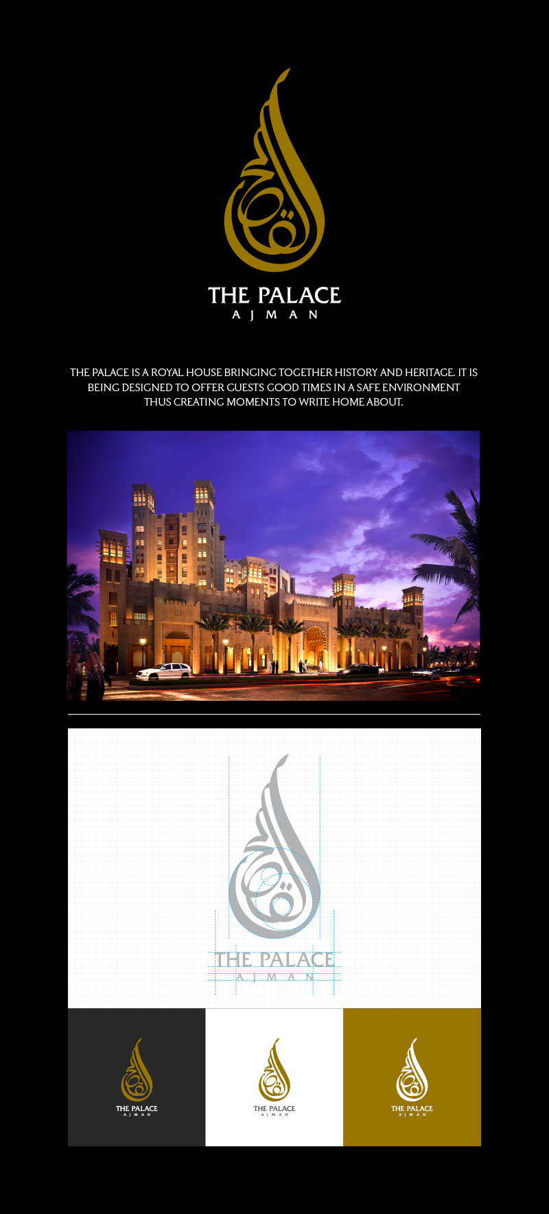
The mark is really nice! The kerning in "THE PALACE" needs some work though. Look at the space between each letter, and compare it in pairs.

wow! wouldn't know what the meaning behind the mark, but looks great. well executed amigo.

Uh-oh! It seems the client is planning to change the name which means this might end up in the recycle bin :(

Will keep you posted guys.

been there. good luck. what a shame. =|

I hope you can use the mark for something, it's really nice. By the way, the long tag line ("The Palace is a royal house...") reads kind of awkwardly to a native English speaker (not sure if you are one or not, or who wrote it).

Captured from web.archive.org on 14 Apr 2015. view this capture