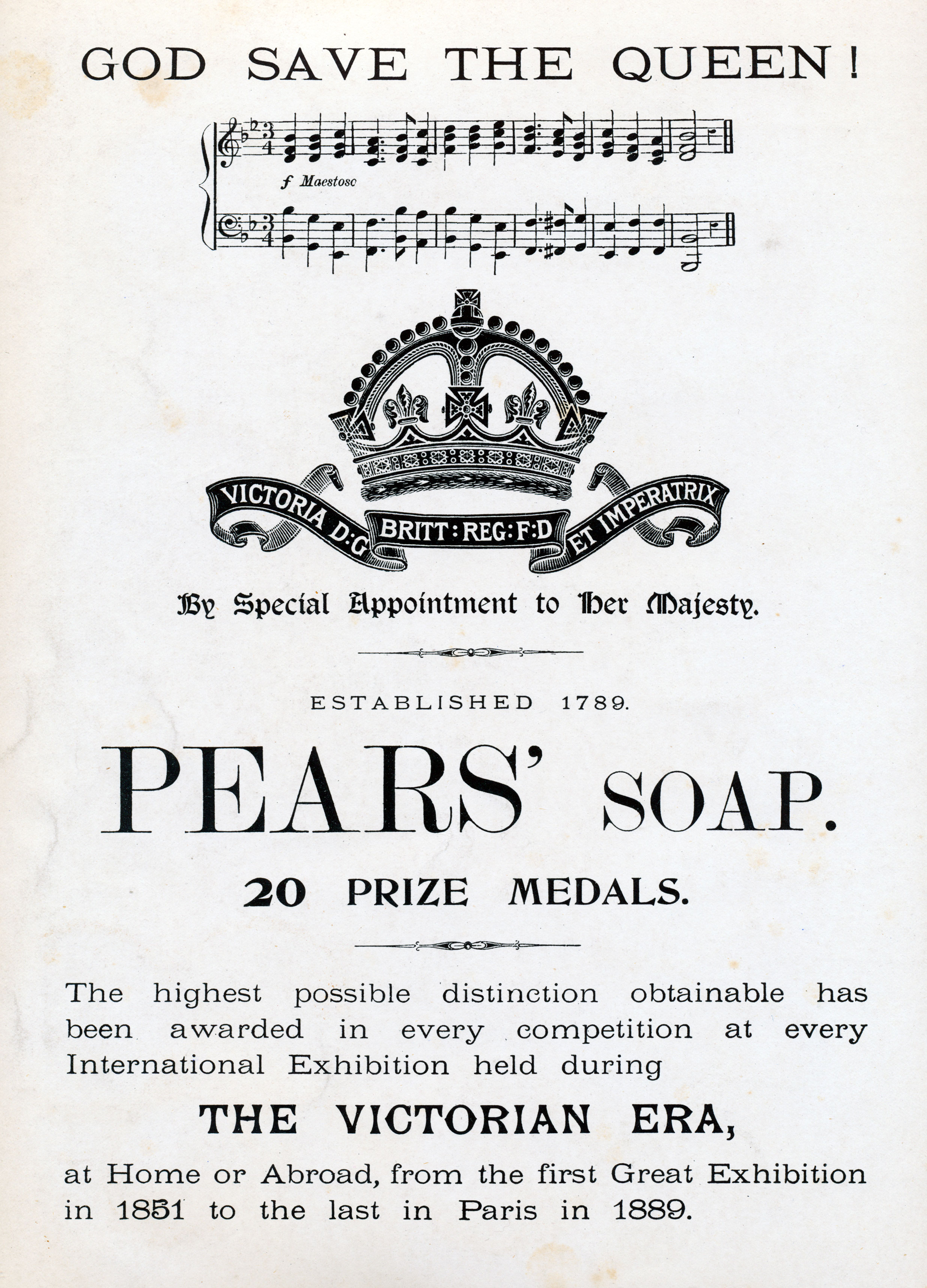
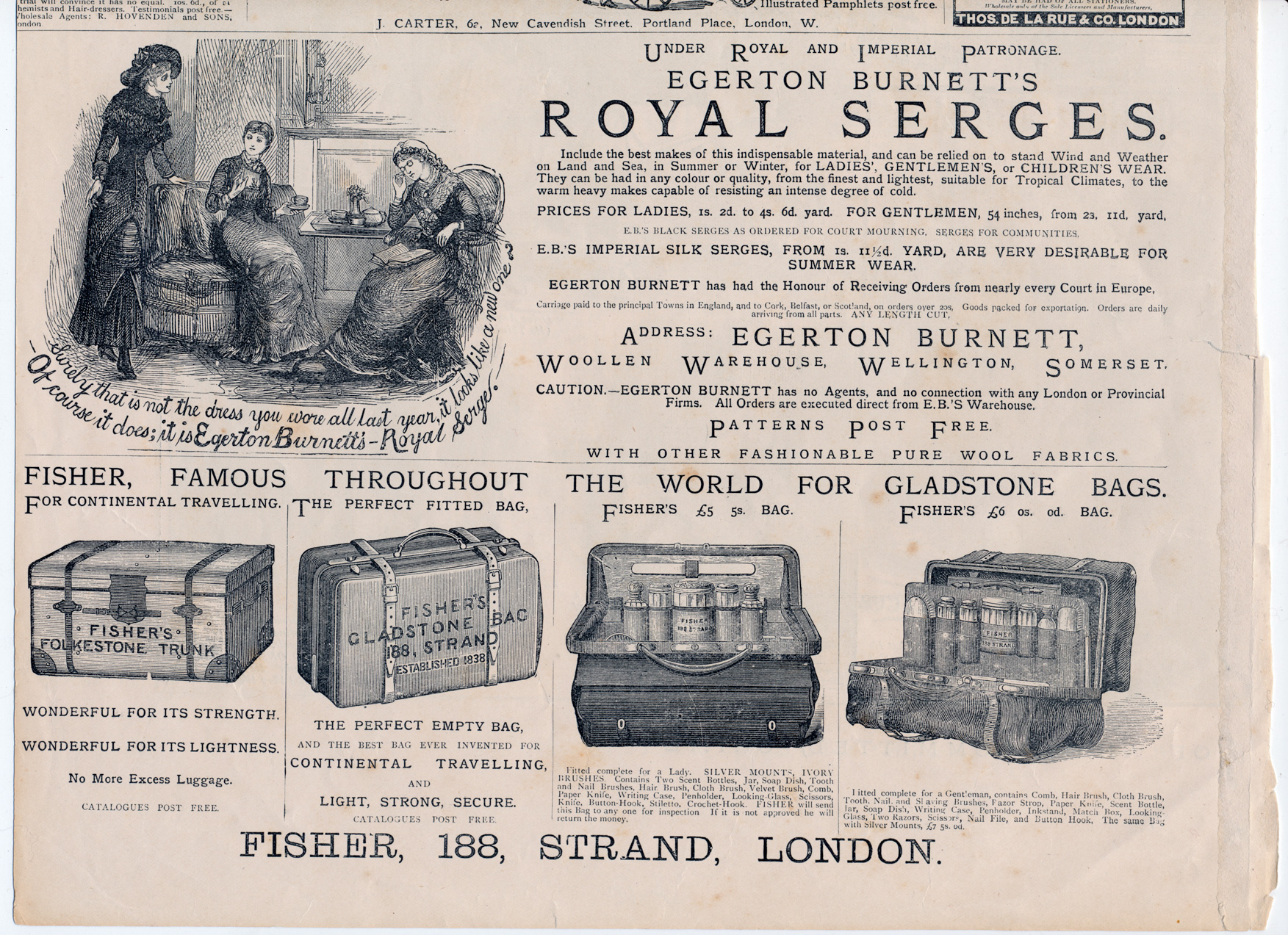
I'm doing some design that is meant to feel contemporary for somewhere around 1850-1870 in the UK, particularly London. I'm a bit of a type noob, and I was looking for some general advice.
I'm not entirely sure where to find good examples, though I've looked at the Wikipedia pages for the following typefaces. I've listed the reason I'm cautious about using them beside their names:
- Baskerville
- Much too early, and apparently fell out of favour until the 1917 revival.
- Garamond
- Created at the end of the 18th century (edit: more like the mid-16th...) - would it have fallen out of fashion in the intervening period?
- Bodoni
- Again, could be too early, and not very British.
- Didot
- A bit more appropriate date-wise, but would it have made the transition to the UK?
- Scotch Roman
- Right time period, but according to Wikipedia it was "popular in the early nineteenth century, particularly in the United States and to a lesser extent the United Kingdom." So a possibility, but probably not the foremost choice.
- Caslon
- While it was created much too early, according to Wikipedia it "saw a revival between 1840–80 as a part of the British Arts and Crafts movement." Furthermore, it suggests that "for many years a common rule of thumb of printers and typesetters was When in doubt, use Caslon." This makes me think it's probably the best pick.
For what it's worth, this is almost certainly going to end up as a series of screen-exclusive work. I'm looking for both display and body type. Any print that comes about will be a secondary product. And obviously, I might go make an aesthetic choice to go with something historically inaccurate.
Has anyone got any thoughts they'd care to share? Any further opinions or suggestions would be welcomed. Many thanks for reading!