
This family was inspired by a Type Battle here at Typophile: How would you design a font metrically compatible with Helvetica, but better than Arial? Working with preset letter widths was an interesting constraint, both a relief and a limitation at the same time.
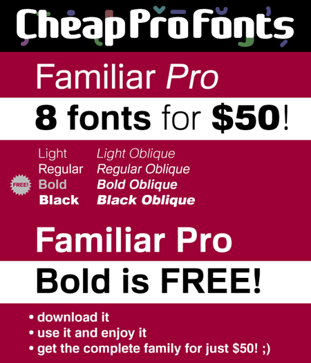
I have done all the 4 basic weights, and the skewed obliques (done to a slightly less steep 10 degrees angle as opposed to the originals 12) has been optically adjusted. The letters have been designed quite close to the german/swiss grotesk tradition, but by using super-elliptical rounds, rounded dots and slightly curved outer diagonals the end result is a friendly looking font family that still looks... familiar.
http://www.cheapprofonts.com/Familiar_Pro
Please enjoy the free "Bold" weight of our new 8-face family Familiar Pro. Download it and take it for a spin. Test out the quality of the outlines and the language support - and then come back for the rest of the family! ;)
http://www.cheapprofonts.com/Familiar_Pro_Bold
Roger
--
http://www.CheapProFonts.com
High quality multilingual fonts at a low price - for professional (non-english) designers with a small budget!
Follow us on:
http://www.facebook.com/CheapProFonts
http://twitter.com/CheapProFonts


