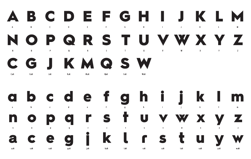
I'm working on the black weight of a geometric sans. It's meant for large point sizes. For far there's A to z with metrics. No kerning yet.
I'd really appreciate a moment of your time to give some feedback. I'd like to hear your opinion of the work so far, are the any quirky curves, evenness of strokes, design, balance, spacing, etc. I'm aiming for quality result, so please be as picky as you like.
I'd like to keep angles sharp (/A, /V, /N), is it something you wouldn't recommend? Why?
I've made some alternate glyphs, as I'm not yet sure if to make the font more geometric or softer or maybe include all alternates into the font. Some glyphs like the spurless /r.alt doesn't seem to fit in with the rest.
What are your thoughts?
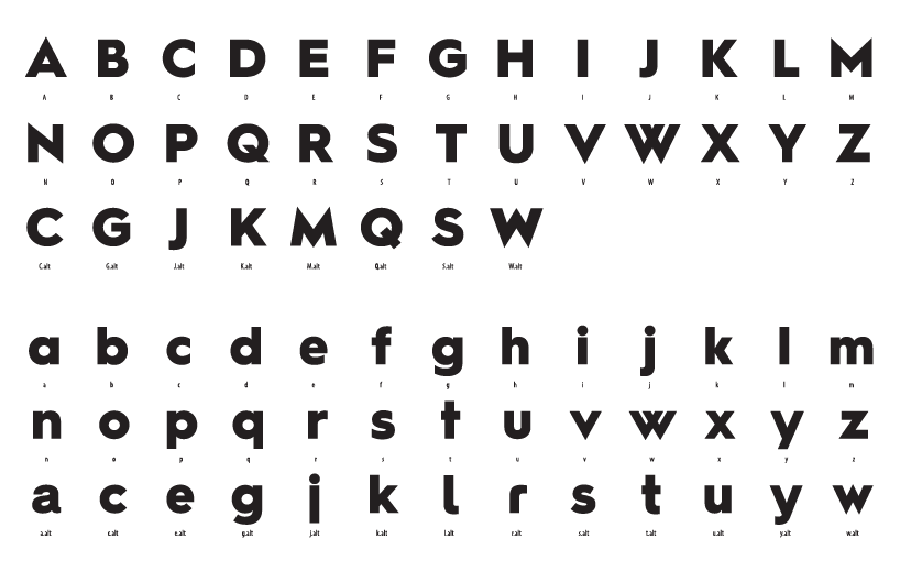
| Attachment | Size |
|---|---|
| black_weight_typophile.png | 44.98 KB |
| black_weight_typophile.pdf | 203.61 KB |