
Hello Typophiles.
I'm working on the bold version of my first typeface.
Does it look good?
Please it would be great to hear some comments about it.
Thanks.

| Attachment | Size |
|---|---|
| correction regular 3.pdf | 56.56 KB |
| correction regular 4.pdf | 70.96 KB |
Hello Typophiles.
I'm working on the bold version of my first typeface.
Does it look good?
Please it would be great to hear some comments about it.
Thanks.
| Attachment | Size |
|---|---|
| correction regular 3.pdf | 56.56 KB |
| correction regular 4.pdf | 70.96 KB |

It loooks very interesting. I’d reconsider that a.

the bold version is very nice, except the "s" which seems stilted to the left.
that "a" looks angry! especially in light version, same thing for d, b and q in light version. Stroke terminals look inconsistent, for example you have completely vertical cut in "z" terminal (geometric form maybe?!) but none of other characters have a same kind of logic, or you have different kind of stroke weight in terminals. I'm not a pro and maybe these are just bullshits and I'm just stating what I'm perceiving, I don't have a solution . but just my opinion. :)
Frode: Thanks for your comment. I'm not sure about what you mean about /a/ Can you be a bit more specific about that?
Bahman: You are right about /s/ thanks! In the case of /z/ I followed the same cut that I've chosen in the other two horizontal stems for the lower case /f/ and / t/ and that logic is coherent with the treatment in the upper case. You can see the regular here http://typophile.com/node/80624 But, really this is my first font as i said before and if you can give me an explanation about what is not working I would appreciate it. Thanks Bahman!

I promised to give you more extensive critique some time ago, so here it is:
The tails in p and d really look out of place to me.
The sudden straight cut-offs don't really work for me.
What you did with the ascender of d, is also visible in Karmina Sans, but I prefer it cut off the other way around.
Don't be afraid to make the t slightly wider, more towards the f.
s in both bold and regular leaning backwards and topheavy.
The top of the e leans towards the right too much.
The top of the q needs something to make it's height optically equal when it's next to a /u/. Have a look at the q (and b) in Quadraat, bij Fred Smeijers.
Keep going!
Thanks Jasper! Great critique I'll keep working.
Hello.
how does it look now?

Much better. Still some disturbing sudden cuts and the e is somewhat heavy on top.
You nailed the b and q!
Thanks Jasper.
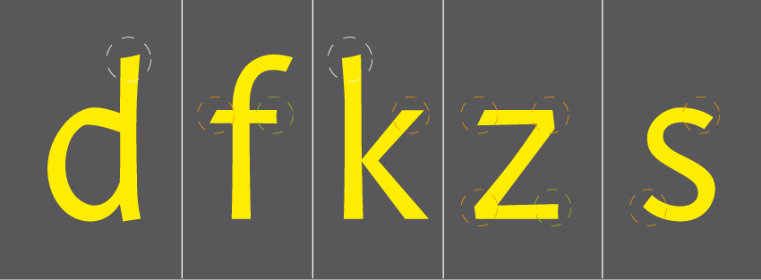
I should make all the cuts like the top stem of /d/ , is that what you mean with the sudden cuts or that modulation on /d/ is not working at all?
1. Yes all cuts on the top of stems should be like the k (k, not d).
2. The modulation across the entire typeface doesn't work. For example the curve on the inside of the bowl in /d/ has one of those 'sudden cuts' where the curve is interupted. I would just get rid of that whole idea, but if you insist on having those 'sudden cuts' have a really close look at how Alexei Vanyashin incorporated them in his typeface. http://cyreal.org/typefaces/florian
3. The tapering in the k (bottom right) is too much.
4. Why make one stroke end at an angle and one stroke end straight in the z? Same for f.
5. My Sensato is actually quite similar to this, so you might want to use it as a reference to see how I solved the problems you're encountering now, but bare in mind that Sensato is by no means finsihed and far from perfect.
Keep going!
Check this out:
http://issuu.com/avanyahin/docs/florian-super-promo-en#download
Skip to page 3. It shows an awesome pict which also explains acute joints (acute joints is a much better description than 'sudden cuts'.)

Why make one stroke end at an angle and one stroke end straight in the z? Same for f.
Why not? :-)
You have different scenarios for strokes. in some places one stroke starts with angled cut and ends with straight cut or vertical/horizontal cut, but in other places it doesn't. even if they are very similar forms. It seems that you are trying to blend some ideas from different styles or typefaces but I think it needs more polishing to create a united typeface. and I agree with jasper in case of the curve inside of the /d/ bowl, this is not a problem that you created that way, it makes me feel that eyebrows of the /d/ is folding and he/she is very angry! I wonder if anyone else noticed it or not? in the /s/ contrast got lower, different from contrast of the /d/ or /k/. a suggestion about presenting your typeface, If you upload it in black and white, the judging of the typeface would have been easier, color makes the expression of the letters different.
I understand that I should commit with one solution on that modulation problem and I really prefer the acute joints, that was the initial idea of the font and I've been missing that path. So I have to get back to work and take the time to analize all that acute joints modulation.
Thanks for all your comments. Great help!

Hello Typophiles.
This is the result of the previous decisions about the acute joints and the modulation problems. Please share your comments about it. (new pdf attached)

I did two versions of /k/ and /a/. I prefer the seconds but I think that maybe the /k/ is slightly dark now.

/a/ number 1, very well done, I like it a lot. I don't know if there is any similar typeface that has this kind of /a/, but it seems new, fresh and strong to me. I think this might be your first idea that could grow into other characters. /k/ number 2 went too far and kerning needs working.
Thanks Bahman. Did you look the pdf? I've trying to apply this idea to the lower case. Which are the most problematic?
yes, I saw it, but still I think the /a/ is more fresh than other characters. counters still needs working, terminal of /e/ is too thick for that /a/.

Sorry, I didn't see that the new pdf wasn't uploaded.
Much better already. Great improvements!
The n and alikes might benefit from a little smoother curve. It seems to 'sharp' compared to the other letters.
I think you need to make the contrast between diagonals larger. In the v, for example, the right diagonal looks thicker to me (should be the other way around).
I think the top of the bowl in /a/ needs to be steeper to match the top of /a/.
The tail in /l/ needs rethinking or removing.
The g needs more 'humanisticness'. It looks like you added acute joints to an otherwise 'plain' g. Perhaps shape it towards this g: http://new.myfonts.com/fonts/artlebedev/mezzo/
The bottom terminal in c should end thinner, more towards a point.
Keep going! You got something great in the making!
Thanks for your comments Jasper!

New pdf attached. I've made important changes in /g/, I've added more color to diagonal stem in /s/ and some of the acute joints that were resulting odd in the print test were corrected, also I followed Jasper's observations.
Any critique about the progress of the font will be appreciated.

Don't take anything I say too seriously as I'm no expert (as you can tell by my thread), but the /w/ seems to jump out at me; either it's too dark or lacking the contrast of the other characters.
I really like your work and am looking forward to seeing the progress!
Thanks James, you're right about /w/ it's too dark compared with other caracters.
Beautiful g!
y w v need work. Keep going!

Very nice - hope you continue and make available.
Captured from web.archive.org on 14 Apr 2015. view this capture