Typophile

Aldus: Greek vertical kerning?

Craig Eliason

A student of mine has this query that I thought Typophiles might be able to help with:

- - -
For my current final paper, I have chosen to evaluate the life and printing/publishing legacy of Aldus Manutius, including his innovations in the way of printing Greek script during the early 1500s.

While researching this topic, I came across a claim from the work In Aedibvs Aldi: The Legacy of Aldus Manutius and His Press that it was a system of “vertical kerning,” among other typeface enhancements, which allowed Aldus to produce a successful Greek type. In addressing Aldus’s application for Privileges to the Venetian authorities, the book states,

“In justification for this application, Aldus mentions somewhat mysteriously ‘two new methods’ which he has invented for the printing of Greek. What these new methods were is not entirely understood...Barker...believes that the two methods mentioned were the vertical kerning of the letters and the system of using separate sorts of accents and letters.” (p. 34)

Earlier on, the source describes the physical attributes of the effect of this “vertical kerning” on printing Greek type with all breath and accent marks, stating:

“One important problem this first font had was that Aldus’s system of vertical kerning frequently produced ‘collisions’ between ascending and descending letters in adjoining lines. The first solution to this problem was to expand the amount of space between lines, but as Aldus continued to develop his presswork other improvements were made.” (pg. 31)

Although I have a mental picture of what this “vertical kerning” may have looked like, I haven’t been able to find any illustrations of the process, and I am therefore shaky in my description of it.

If there is anyone out there who can act as a reliable source, or has access to a reliable source which illustrates and explains vertical kerning in more detail, I would be very grateful for your help. Any illustrations of vertical kerning being used for greek type would be welcomed as well. I find this topic fascinating, and this is a piece of my research puzzle that I really need to solve to bring the topic together.

Here is the citation for the book I’ve been using:

Angerhofer, Paul J., Mary Ann Addy Maxwell, Robert L. Maxwell, and Pamela Barrios. In Aedibvs Aldi: The Legacy of Aldus Manutius and His Press. Provo: Brigham Young University, 1995.

I look forward to reading your responses!

One question I had was: if the crashing was solved at first by adding leading, doesn't that make all the trouble of vertical kerning pointless? I wonder what the "other improvements" to solve the crashing were.

Are there other scripts/writing systems with which vertical kerning has been tried (in metal types)?

I'm guessing that it means he was making type where some parts of the letter (accents) extended beyond the type body at the top, instead of on the sides, which is more usual. So, yeah, adding leading would defeat the purpose. Maybe some horizontal adjustment was being made to avoid collisions?

More from my student:

- - -

"One question I had was: if the crashing was solved at first by adding leading, doesn't that make all the trouble of vertical kerning pointless? I wonder what the "other improvements" to solve the crashing were. Are there other scripts/writing systems with which vertical kerning has been tried (in metal types)?"

I have both the Barker and Angerhofer sources, and Angerhofer is the only one which addresses the first issue. As I quoted before, Angerhofer states, "The first solution to this problem (the collisions) was to expand the amount of space between lines, but as Aldus continued to develop his presswork other improvements were made" (pg. 31). This indicates as well to me that more leading was the obvious answer to this problem. Barker doesn't address the collisions at all, but to answer the second question, he does state that this method had been used before:

"Neither of these was wholly new: vertical kerning had long been in use, if not for Greek type; separate accents had been used with conspicuous success in the Vicenza Chrysoloras. But if these were the two 'methods' that Aldus intended to protect. What counted, as far as the privilege was concerned, is that neither had been used before for the printing of Greek in Venice." (Barker, pg. 93)

Barker, Nicolas. Aldus Manutius and the Development of Greek Script & Type in the Fifteenth Century. New York: Fordham University Press, 1992.

Very tricky.
The original lead-type corpora vanished. I don’t know of any surviving artefacts. So the only proof remaining seems to be the prints inherited.
– Any efforts known to investigate and analyse the prints for the issue in question?

I haven't read either book and don't know much about Aldus' Greek type, but I think I can envision what's being described. If the diacritics are on separate sorts from the letters, then the bodies that the vowels and rho were cast on must have been shortened above and in some cases below to leave space for the diacritic sorts to be inserted. Presumably it's these spaces where the body is shorter than usual that are the "vertical kerning" referred to. In practice, for dealing with eta and some ligatures, you might need to have some diacritic space below/above adjoining letters as well.

So he would be casting at least some of the letters without ascenders on a body that extends up only to just above x-height, and casting at least some of the letters without descenders on a body that extends only just below baseline. But then for tightening up you would probably want small leads to fill in the gaps between x-height and ascender height (and between baseline and descent) for sequences without diacritics.

This doesn't seem like the simplest way of casting Greek type, but I suppose it would keep the type case down to a reasonable size.

ETA: This example of Aldus' Greek uses an eta without descender, which solves the problem of placing iota subscripts without requiring any space under the preceding letter. And I don't see any ligatures that would cause diacritics above the letter to be displaced horizontally either.

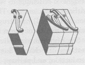
If they were on separate sorts, I don't think they would use the word "kern". Here's what "kern" meant in foundry type:

The part that sticks outside the body is the "kern". I think vertical kerning would be when part of a character (an accent in this case) extends beyond the top of the body and into the descender space of the line above.

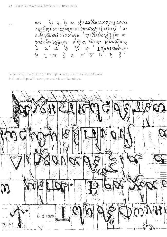
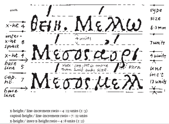
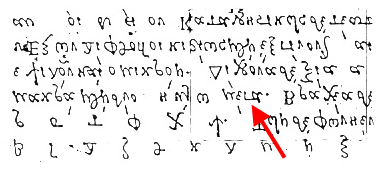
Craig, I strongly recommend that your student read Peter Burnhill’s Type spaces: in-house norms in the typography of Aldus Manutius. Burnhill’s detailed analysis of Adline microtypography includes an attempt to reconstruct the underlying arrangement of sorts from measurement of the printed page, as shown in this image. On the right hand page, you can see (compositor’s view, upside down and backwards), the descenders of some letters sitting on top of the body of letter and spacing sorts in the next line. This is what I would understand by ‘vertical kerning’.

[In other words, what Mark Simonson said.]

John, that seems like precisely what she's looking for. Thanks for the lead!

For all we know, Aldus may have stepped the type blocks of accentable letters, putting a shelf in the extender area, on which shallow-bodied accents sat.

Really tall diacritics (stacked, eg. psili with perispomeni) could have bridged lines, which would be vertical kerning.

With this method, it wouldn't be necessary to pack the gaps left for accents, in non-accented letters, with spacing material—which would be necessary if separate accents and letters were all the same body depth.

My guess would be double hitting the page. The first time through were the letters and the second form only with the accents. Perhaps this is why there were occasional collisions. Tight registration in that time was more than difficult.

And No, I have absolutely no proof of this ;-)

John: That's almost exactly what I was picturing, except that it's the descenders that are kerned instead of the accents.

Nick: If anything that would be mortised type, not kerned type.

Chris: I remember hearing that designer and typographer Mo Leibowitz used that method in order to get tighter letter spacing and negative leading with metal type. Pretty time-consuming and tricky, I imagine. It's more or less what we call kerning nowadays (exceptions to standard spacing), but that's not something that would have been described as kerning in the metal type era.

(The term "kerning" has drifted so far from its original meaning that many young designers seem to think it means the same thing as "spacing".)

> (The term "kerning" has drifted so far from its original meaning that many young designers seem to think it means the same thing as "spacing".)

Yes, one of my biggest pet peeves. But I suppose I’m just going to have to get over it, one of these days.

Mark,
If I were to do it, I would first run the 1st form as text without accents. Then I would tweezer out only the base glyphs to be accented and replace them with glyphs of accents only but a bit higher than type high--perhaps drop a spacer into the vacated slot to raise the accent above the rest. Next, I would add one 3pt (or whatever) slug from above the form which would shift the accented form down the needed amount. I would then reduce the packing to allow for the higher type position. Then run the second form.
This would be "vertical kerning" because I would have shifted the accents closer to the base letters without worry of decenders above. This method is not much different than two color letterpress where the first form may be a table of figures or text in one color; then followed y a 2nd color form of rules set to the same leading and measure with a slug inserted to shift the form so the rules hit between lines of the first form. There would be no need to make any adjustments to type height or packing with this though.

This method would require the casting of all polytonic accents and breathing marks at the exact widths of each of the base letters which receive accents (they could even have been cast taller than type-high to eliminate the need for the spacers). This is a much smaller number than the entire Greek alphabet because many glyphs are never accented. Perispomeni have very few host glyphs, for example.
The amount of pressure and inking required for such a sparse setting as the 2nd form would be less than a full block of text so doubling of the lower dropped base glyphs would be unlikely.

Sure, he could have done something like that, but you're using the word "kerning" in the current sense. If that's what Aldus did, they would not have called it "vertical kerning" in In Aedibvs Aldi: The Legacy of Aldus Manutius and His Press, since historically that's not what "kerning" meant.

Anyone who has had set type is surely familiar of the problem created by a piece of grit on the type bed that raises a single glyph above the height of the rest. This could have been the happy accident which gave those 15th century printers the idea. Instead of cursing the grit, perhaps they had a Eureka moment?

Again, this is all pure speculation on my part. I am just trying to think of what may have been possible given there equipment. My letterpress setting days ended in the early 1960's using ATF type on a Vandercook so I am sure they had some different problems with their equipment.

Sorry, Mark, we cross-posted.
I don't know how well the wording used in the Aldus book fits what they did versus how they described it. I would not be terribly surprised if their terminology were purposely misleading to protect their "trade secret" ;-)
I do remember hearing Warnock speak about the differences between hinting in PostScript vs TrueType at Seybold in the late 80s. He was being as vague as possible pretty much saying that the Adobe method was much "simpler" but got the same result. Jobs and Gates were also presenters and were equally vague but cock sure that their way was better. The rest is history, as they say, but I assume having trade secrets was no different in Aldus's time.

Again, this is pure speculation.

×

Part of Burnhill’s analysis of Adline norms relies on misprints in which the top or bottom edge of a sort makes a visible impression, e.g. because of grit on the type bed as Chris describes. Such accidents enabled Burnhill to accurately measure the body height of Aldine sorts and, among other things, confirm that no leading strips were used: interline spacing was determined directly by the body height with what we might now call ‘built-in leading’.

The method suggested by Nick, with decomposed accents fitted to mortised bodies, could have been done, but I’m not aware of any physical evidence for it, and I don't think it would have been efficient. Burnhill suggests that accents were kerned off narrow sorts following the letter or, in some cases, on either side of a letter, which explains the inconsistent spacing between tone and breathing marks. This technique preserves the standard horizontal composition of sorts, without introducing a new class of mortised bases and vertically composed elements.

More controversially to my mind, Burnhill’s composition reconstructions suggest that at least some ligatures were composed of what we would think of a contextual variants. I'm willing to believe that it might have been the case, but I'm not sure whether the physical evidence supports it. Certainly, subsequent generations of renaissance Greek printers using Granjon’s types and those derived from them, did not do this, and the catalogue of Greek sorts from Enschedé and Oxford show precomposed ligature sorts. The trouble I have believing that the Aldine books were composed using contextual variants in this way stems from just how difficult this is for the compositor. It is something that we can do today because we have computers to perform the lookups for us, and they don't get tired and they don't get sloppy. The only handset type system I am aware of that definitely did use contextual variants— Mühendisoğlu’s Ottoman Arabic type—proved to be overwhelmingly difficult for compositors: even within a single book the quality of the typesetting degrades, with more and more mistakes being made.

[By the way, if anyone comes across examples of Greek capital letters with tone/breathing marks on their left, i.e. the ‘standard’ position, prior to the 19th Century, please let me know.]

Chris: Right. Basically, I'm assuming that in In Aedibvs Aldi the term is being used in the historical sense of the word and that, in doing so, they are saying what they believe to be Aldus' technique. Whether this is how Aldus actually did it or not, or what he called it (to his confidants)...<shrug>.

I thought of another way to do this which would have been even easier than my first conjecture.

Suppose that we set every other line of text on a page and then places a slug the exact height of whatever text plus leading they used. (perhaps just stacked as John indicates from his reading). We then print even lines as form one and odd lines as form two. This would allow for the mortising in of the accents in the slugged line either to mark the the text on the following line of form one or to appear where they would need to be for the 2nd form when those lines were printed? Since the accents were not perfectly aligned in several cases, this could indicate either a small missed measure or miscut of the slug to fit the accented glyphs?

This eliminates all of the tweezer work and packing changes but adds the time to slug and space the accented lines.

Here is a scan of Peter Burnhill’s compositor’s view reconstruction of a portion of Lascaris’ Erotemata of 1495, a primer of Greek grammar. One of the interesting aspects of this project, to which Burnhill draws attention, is that Griffo’s type for it is deliberately a handwriting font, designed as a model for the student to follow in learning to write Greek. Another, and crucial aspect, is that Griffo was obliged to fit this Greek into the body height (matrix mould aperture) of an existing Latin type selected for the composition of the explanatory Latin text; Burnhill’s analysis of the implications of this constraint is central to his reconstruction of Griffo’s solution.

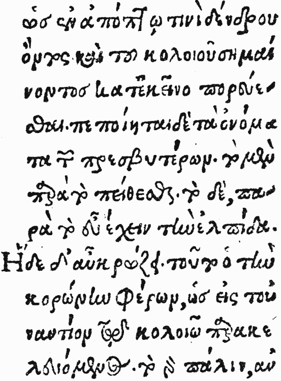
Here are 2 images from Scholderer's book.

Plate 10 (Batrachomyomachia.Laonicus, Venice, 1486) is 2 color indicating that printing every other line was a known method then,

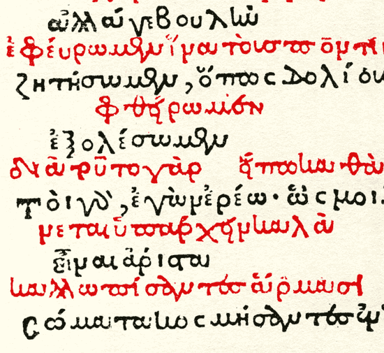
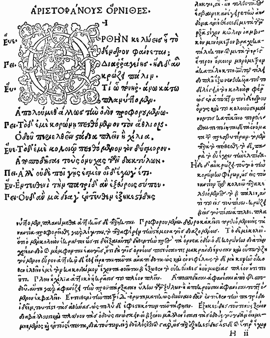
Next is Plate 21, Aristophanes, Aldus, Venice, 1502
Notice the poorly placed accents, odd spacing of breathing marks and generally scattered look to meshing of placement of accents to base glyphs.

Here is as much of the page that fit on my scanner:

John,

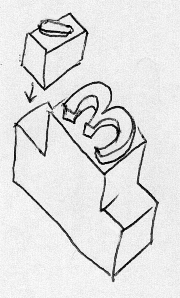
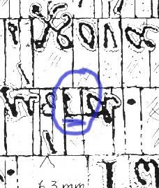
I see what you mean about Burnhils theory, Is he showing parts of glyphs mortised into the line above or are there 3 piece on two lines?
This also is interesting as a graphic:

Is he showing parts of glyphs mortised into the line above or are there 3 piece on two lines?

Not motised; rather, a classic kern, i.e. an unsupported part of a glyph overhanging the edge of one piece of type to rest on top of the face of an adjacent piece. Mark’s illustration of an italic f shows the common horizontal kern; what Aldus appears to have done is the vertical equivalent.

Thanks, John. I did not mean those parts of your pix. That is the normal overlap used for italic faces That I have always seen. I meant this little dittie here in the middle:

In the corresponding, right-way-around image, this is one of the things that Burnhill identifies as a ‘horizontal junction’, i.e. a ligature formed by two contextual variants with a that join along a connecting stroke, in this case a τα ligature, I believe, as part of the word μέτα. The horizontal line in the area that you highlight is part of the glyph, not an indication of a mortise in the sort; see the, flipped, print image:

Thanks, John. That clears it up nicely.

My guess as to what was meant would be very simple: to allow accents to be placed above lowercase letters, without the need for making type slugs bearing every combination, Aldus went and turned the ascenders, not the descenders, into kerns. And, for capital letters, the space between cap height and x-height to boot.

That would have indeed allowed collisions with descenders in the absence of adequate leading.

But that wasn't what was requested - instead, some actual evidence that Aldus Manutilus actually did it that way, instead of some other way, some source with more details than the phrase "vertical kerning", was requested. And, indeed, the illustration from Burnhill shows that he was indeed thinking of the descenders being kerns.

Now, all we have to do for the OP is find out if Barker thought the same way.

Ah.

"Aldus Manutilus and the Development of Greek Script & Type in the Fifteenth Century", by Nicolas Barker, Fordham University Press, says on page 85...

that vertical kerning was not used with Type 2 (mostly used as a small supplementary type), Type 1 not being part of the Google Books preview,

and as for Type 3,

"Raised spaces again show that a third, even more revolutionary, but far simpler, solution was now introduced to deal with the problems of composing separate accents. This involved a reversion to kerning, in this way: the nominal gauge of the type, 4.2 mm, remained constant, but the letters were cast on a 3.15 mm body, kerning equally (up to about 1.6 mm) at head and foot; the accents were cast on a 1.05 mm body, occupying the appearing space between their proper line and the line above. The relative rarity of kerning sorts made collisions much less frequent than in the first version of Type 1:"

so Type 1 did have vertical kerning of some sort.

... so one just has to turn back nine pages from page 93 to page 84, and the mysteries should all be revealed.

Captured from web.archive.org on 16 Jun 2011. view this capture