Typophile

Another "what's this design element called..."

Dave Williams

Someone was asking recently about designs/logos made of stripes where the design was picked out by changes in the stripe thickness. I have in mind a similar, but different effect:

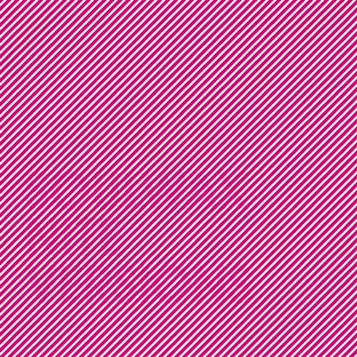
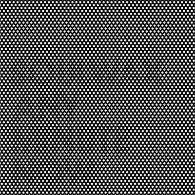
I've seen designs where the image appears, at first glance (especially when you look at it quite close up) to be just lines, usually diagonal. But then, if you look at it from a little further away, or move your head and the page relative to each other, you see text or a graphic element, subtly hidden. It's not a change in the direction of the lines, nor an immediately noticeable change in the line thickness (unline the previous person's question).

(a) do you know what I'm talking about?
(b) if so, has this thing got a name?
(c) how's it done?

Cheers

.

I think you are refering to this;

I'm not sure if there is a proper name for it other than 'optical trickery'

it is done by slightly altering the thickness or size of the elements (lines/dots).

That's the one, Wouter. (Especially the top one.)
So it is just line thickness, then: merely more subtle than in the other guy's query!

I bet somebody somewhere's given it a name though!

Wow that's very cool.
I see the words so much better with my "bad" eye, or when I take off my glasses, which correct my stigmatism, or when I move the image with the scroll bar.

> I see the words so much better with my
> "bad" eye, or when I take off my glasses

Me too. I'm not sure why.

Words? What words? ;-)

Yeah, that's the "other" recent thread I was referring to. Of course, in those, there's no optical "trickery" since the line width changes are strong enough to be obvious without having to take your specs off or wiggle your head about! :^)

I think the official name is 'Zat headbonesplittenen badwordcursenen paininzeeyes'.

LOL ... :^)

Seriously though: I've now got the answer: some of your replies suddenly reminded me of the 'spatial frequency' effect, as described in a Scientific American article (here).

Doing a Google image search on "spatial frequency" brought up results including those very same images that Wouter linked to above: thus.

I just never made the link between these two types of images...

OpArt?

Well, quite: it's easy to imagine that Bridget Riley would have had a field day playing with this!

Ouch my eyes.

Those Soulwax images need a bit more letterspacing :-)

I wonder what the implications of this optical illusion are for reading theory.

I wonder what the implications of this optical illusion are for reading theory.

Try looking at these images intensly for a couple of minutes and then try to read a page of text and you will know ;-)

Captured from web.archive.org on 21 Oct 2013. view this capture