Hello all,
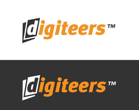
I've been asked to create this logo for a company that runs a number of workshops across a range of digital and social media subjects.
The logo is to be used online and in print in the UK and the US. I've used MetaPlus Black Italic which I've chosen for it's robust and modern feel. However I haven't yet touched the type which is where I'm hoping your learned opinions will come in. Aside from kerning I'm interested in any minor adjustments i could or should make to the type to a) make it unique and b) help it sit together most comfortably. Of course I 'm only looking to improve rather than change for the sake of it so if the consensus is 'it isn't broken' I'll leave it more or less as is.
Many, many thanks in advance, your opinion is appreciated