Hey everybody,
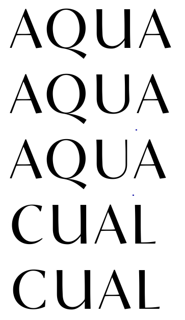
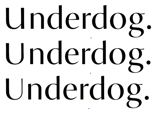
I've been struggling with the capitals of Sensato U lately and the U in particular refuses to look good. I've made 3 different U's, shown underneath.
- The first is a sort of lowercase approach. I've seen this done before, without sticking out as 'wrong' to me.
- The second is a compromise. The basic shape is still there, but the thin vertical stroke is thickened heavily for a better colour.
- The third is the original, based on how I would design a U in a low-contrast sans-serif. The problem with this is that it causes a really light spot when next to letters like A.
- I also included an alternative for the C, also with a more lowercase approach.
I would just like to know what you think of it. Which ones disturbe you the least? Any other critique is also appreciated, as always.
Cheers,
Jasper