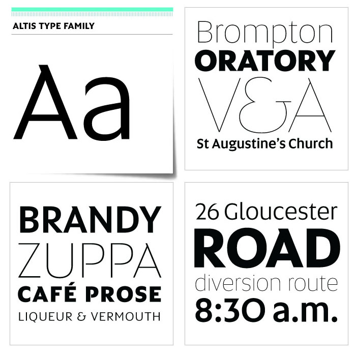
Altis combines geometric regularity and soulfulness into one font family. It communicates friendly and reads extremely well. Bring out its optimistic airiness with light styles or exploit the masculine strength of the bolds. There are ten optically-balanced weights and practical OpenType features, which make the family operationally spot-on.
Read more at
http://www.typolar.com/our-fonts/altis
http://www.typolar.com/our-fonts/altis/features-and-characters