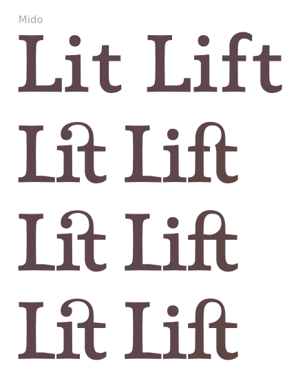
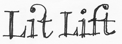
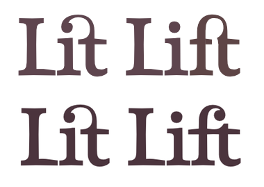
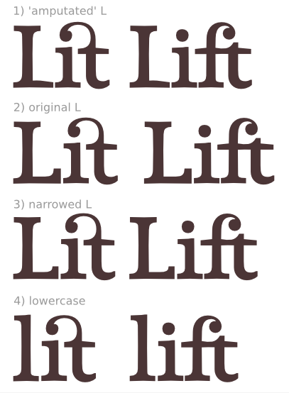
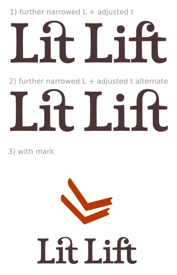
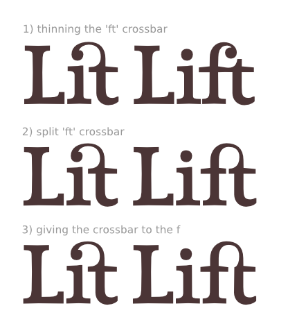
I'm working on a logo and using it as an excuse to make some ligatures. The base typeface is Mido. I'm trying to lighten the words a bit and add some flair with the ligatures.
I'm fairly happy with the 'it' (though feel free to critique) but am struggling with the 'ft'. Are any of these aiming in the right direction? Any feedback appreciated!