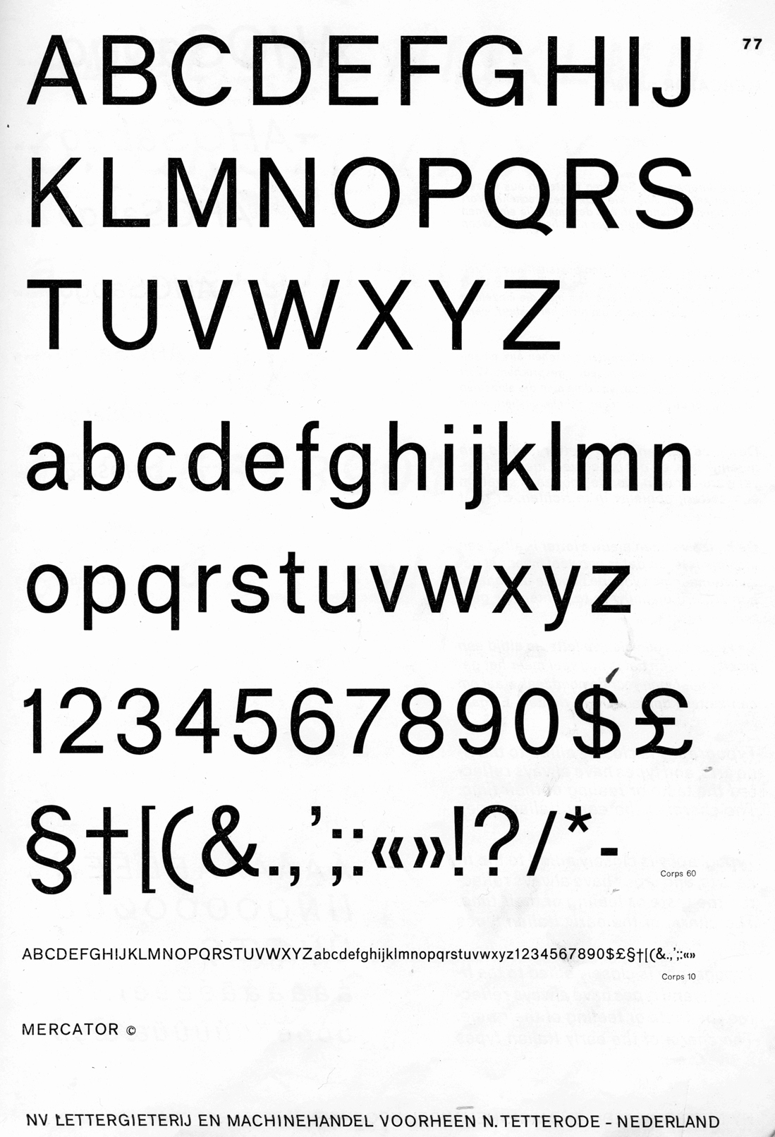
it's far from finished:
the weight between characters is still a little uneven, and some letters i'm not sure about. i was thinking of scrapping the g and starting on a two-story g (along the lines of johnston, akkurat etc.)
i started by wanting to create a grotesque striped down to its simplest form by removing unnecessary terminals.
i kind of gave up on that concept, as the results were not as legible and appeared unbalanced. but i'm not sure whether i should abandon the idea completely? maybe have two versions of the face - limbs and amputee grotesque? :)
i would love some feedback or thoughts on the typeface!
thanks,
hank