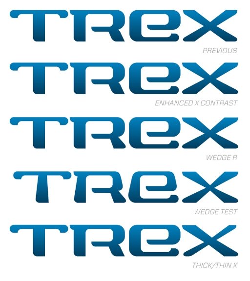
This is the first logo I've drawn entirely from the ground up and am looking for some general feedback on the typography and design. It's for a company that will be selling clothing designed for outdoor enthusiasts and travelers. One of the requirements of the project is that it work well on a waistband. I took this to mean that it should be wide, rectangular, and not suffer too much from being stretched horizontally. Note that the coloration shown is simply to give it a bit of twinkle for presentation; I'm still experimenting with color schemes and mulling over any 3D treatments it might receive online. Applied to products, though, the color will likely be flat and solid, which means I need to produce a wordmark that can stand on its own, without much window dressing.
I welcome any comments you may have. Thank you!