Hello everybody,
well… I'd like to ask for any feedbacks and/or suggestions about the first font I’m publishing.
At the basis I’m a web&graphic designer but I’d like to work in type-design too.
I’ve called my font Radical Display: it is an uppercase-only font family inspired on european typographic tendencies of the first half of 20th century.
It looks rational, geometric and blocky. However, it is based on optical proportions.
This font face is designed to be used for headlines, visual identities or short sentences.
Lighter faces provide a more contemporary and design look&feel, while the bolder ones look definitely retro.
Here below a little demo:
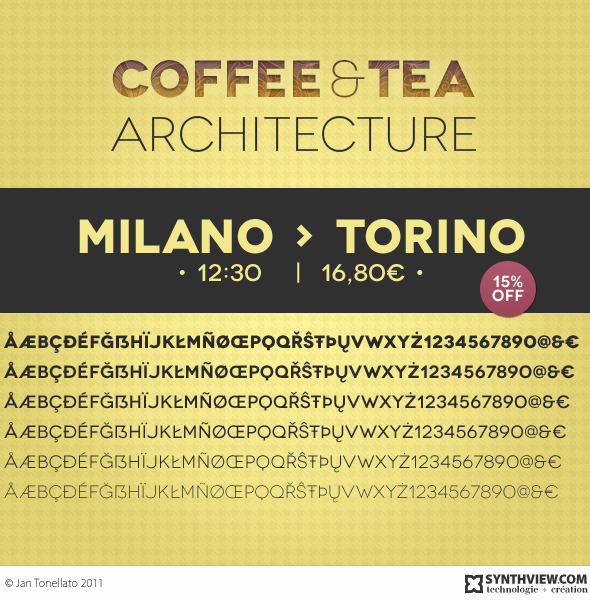
I’ve also created a micro site to show it, add more informations and permit its download typography.synthview.com.
I plan to complete this font by a series of condensed versions afterwards.
Thank you in advance.
Jan