
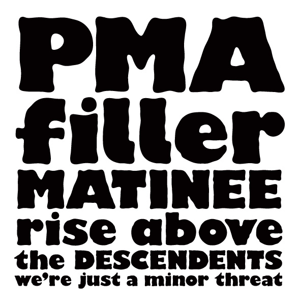
hello friendly people of the type world. I have spent my Easter weekend working on my first little type-face project. Which i have called 'ill sans'. Being a novice at such things i thought I'd start out with an homage to a classic. That way i have a much needed reference point. I have always been intrigued by the black sheep of the gill sans family—the ultra bold weight. It seems so comical and quirky compared to the rest of it's family, which seems, well, quite serious. It's like that Hawaiian shirt i like to wear to work on casual fridays. Anyway, i digress. What i wanted to do was make a kooky rounded hand-rendered version, that was less 70s and more party. I thought it would go nicely with some illustrations that i'd been working on for a little recipe book i'm putting together.
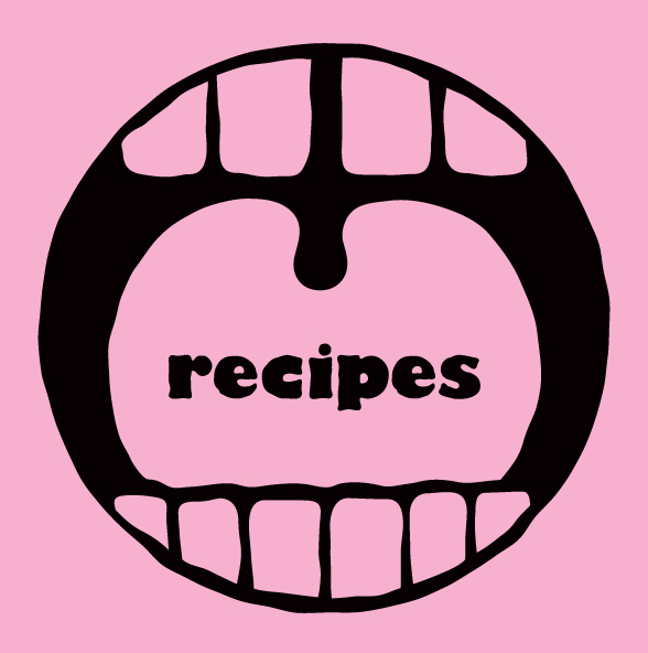
This font is obviously just for display purposes. So i thought I'd try it out for that specific purpose in my recipe book. I've paired it with Ludwig, because: although they may have a different heritage, I find Ludwig to be a beautifully refreshing alternative to Gill Sans. I figured they could be friends.
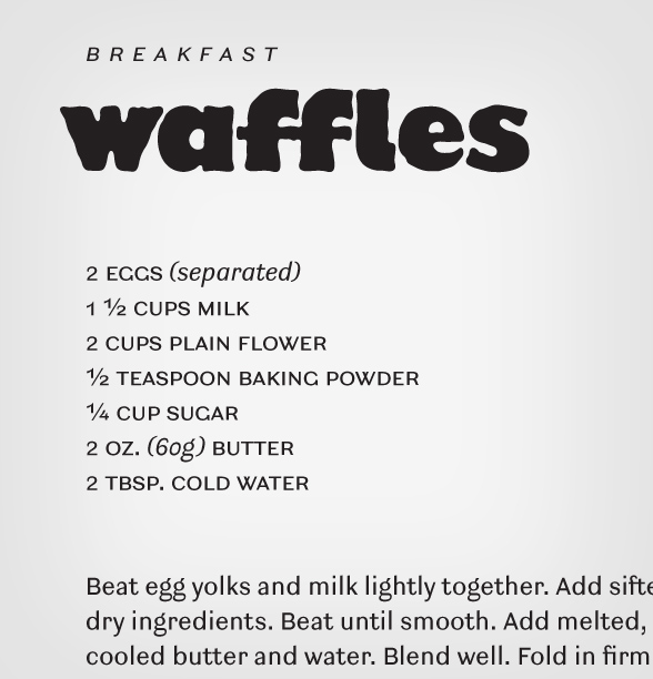
But what i would love to hear is: some feedback. obviously it is pretty clumsy, but that might be part of it's charm? but some letters seem a lot darker in shade than others. but it's kind of like that with Gill Sans Ultra Bold...
things i have changed: i've given the l a tail, and made a single and double storied a. Can't decide which one i prefer as the default. Also—can i expect to get a cease and desist from Monotype?! Looking forward to hearing your aesthetic and legal and otherwise expert advice.
Steve


