
any typographic suggestions and critiques would be greatly appreciated. thank you.
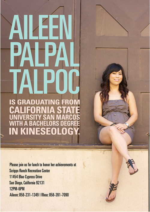
any typographic suggestions and critiques would be greatly appreciated. thank you.

Basic disposition is fine, font choice works okay (Univers?) except I'd avoid using the ultracondensed type at the smaller size, it's a touch distracting and hard to read.
Leading is awfully uneven, especially in the middle section, which creates a rather disrupted rhytm. Same thing when it comes to horizontal alignment - especially the top set of words seem aligned neither to the left or to the right properly. Trust your eye!
Why a single extended line of the type at the beginning of "is graduating from"? Makes it look like an emergency solution, glaringly.
Finally, as a sometime headline writer, I think you're way off when it comes to word emphasis in the middle section. The keywords are "Graduating" and "Bachelor's Degree" (those are the words a hypothetical newscaster reading this out would emphasise), whereas the varying size makes "California State" and "in kineseology" seem like the most important words instead. Try reading it out loud, especially emphasising the type that's bigger, and you'll see how silly it sounds.

This is quite nice.
Kinesiology is misspelt. I'm not sure about the squooshed text on the first and last lines of that section. Maybe you can letterspace instead. Linespacing in that block needs to be evened out. Is there a way to move the text so the join on the beckground is not behind the last letter of each line?
THank you Birdseeding and Bendy. those were very insightful critiques.
How about... now?

the first image i posted, the information at the bottom with the bold condensed font, i feel looks better than the 2nd image. but it is true that its difficult to read. But i like how it created a dark solid shape. the 2nd image, the info section looks very light.
hmm...
Graduatiing!
oops sorry. oh and yes, this is univers font.
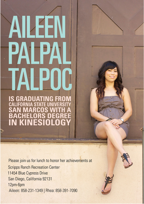
Personally I'd align the name the same way as the block below it, either by resizing the type or adding letterspace, so the right side is all aligned.
There's something funny with the alignment and leading of the bottom section. And wouldn't a date be helpful?


You could use the Lens Correction filter in Photoshop to make the background's seat and center line perfectly horizontal and vertical. This is only necessary if you are as obsessive-compulsive as I am!
http://help.adobe.com/en_US/Photoshop/11.0/WSF65FB40F-00F5-445a-BD9A-38B...
specifically the Straighten tool, and possibly Horizontal and Vertical Perspective, and Remove Distortion.
After using those tools you will have to crop the image a bit to remove the transparent areas created at the edges of the picture.
And congratulations!
I agree with Mugford, the photo alignment (slight rotation) bugs me.
Nothing wrong with a photo being at an angle sometimes, but if it's only a tiny bit off then it can look like a mistake. Either make it straight or else at a definite angle so it looks deliberate.

Count me in as well. Image is just enough off that it looks as an error than a feature. Correct it in either way.
The last font treatment seems fine except that it's still not fine on the left. I suspect it should be lined up (visually of course). Hence /1/ sticks out. Other lines will look aligned when /1/ is aligned with them as well.
Have you taken the photo? Wouldn't it be nice if she had a plate on her lap with and holding a fork in her arm putting it under some angle to give it a bit more dynamic feel? Or just eating off the fork...
And of course congrats to Aileen. :)

I've cheated before and added serifs to the 'I' in universe to fill up a bit of space. The name block is begging to be fully justified and the wider 'I' may make Aileen wide enough to align with the other two names.
Captured from web.archive.org on 17 Apr 2015. view this capture