
Is there a better way to set discontinuous dates than what I've done here? What would be others' preferences?
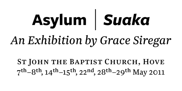
I'll put a bit of positive kerning on the right of the endashes.
Is there a better way to set discontinuous dates than what I've done here? What would be others' preferences?
I'll put a bit of positive kerning on the right of the endashes.

Get rid of the 'th', then put a | or a centre dot in between the dates instead of the comma.
Thanks, Claus. Yeah, I was feeling it was too cluttered too.
I didn't want to repeat the bar in the dates, so here's with the centre dots and commas...I think the dots looks a bit too decimal so probably going with commas. Thanks.
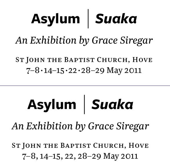

That looks better.
I know it's not the European way usually, but would it be too weird to put "May" ahead of the date numbers? Might help the reader parse the list of numbers as dates.
I wondered about that too, but then the problem is you end up with all the numbers including the 2011 in a list together.
Today I'm learning lots about typography. Good good.

Why are the hyphens there, when comma's would do the same? Or am I missing something? By the way, maybe it would look better with wider spacing around the centre dots.
Good question. Personally I like the typography of having the dashes, though the sense would be the same with commas.
I guess also having the pairs of dates with dashes shows there are some two-day events, rather than a series of one-day events. My brain parses that differently somehow.

Those hyphens look to actually be en-dashes, and is the accepted form for indicating an inclusive range of numbers in text (though easily confused with a minus sign in a mathematical equation). Or maybe it's supposed to be an em-dash. So many things to remember in those style guides; the one I had I gave away many years ago.
But yes, since the dates shown here are consecutive, the dashes seem overkill, unless it's meant to show the event runs overnight or something like that.
I think the dashes help it make sense; I'd keep them.
Yes, they are endashes — I like my dashes and try to use them correctly!

The en-dashes make sense, and are used correctly (or, at least, in the same way I would use them ;-).
I would try a less elegant, yet less bumpy lining figures setting for the last line.
Bendy uses the en-dashes correctly to signify a range. If you were to use the middle-dot I would suggest an en-space on either side instead of the (normal) word-space.
Hm, well I think in my dots example I used thin spaces — i.e. even less than a normal space — so that might have contributed to my preferring the commas.

7-8, 14-15, etc. are not ranges, as there are no days between them. Why not just use commas for all? 7, 8, 14, 15? This is different from an actual range such as 4-15.
Well I can see the point of it if there are events that run on 14 and 15, but not on 22 or something.

Joshua's right, at least that's correct usage in the Scandianavian languages.
Another interesting split of opinion.
Well, you could be right. Here's how commas and bullets look. I've already submitted the version with dashes tho' ;)
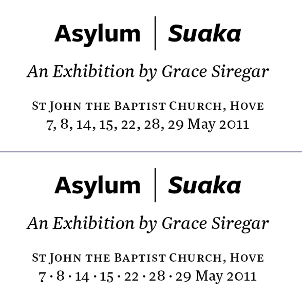
I think I still prefer the version with dashes...easier to see there are four periods when the exhibition is on, rather than a set of isolated one-day events. Seems to me this is an instance to break the rules purposefully.

I think approaching this from a different angle will make it more readily understandable.
Weekends May 2011: 7-8, 14-15, 22, 28-29
Please ignore my post, I was wrong. (I used to be a copy editor, but that was a while ago.)
I think William has a very valid point.
William, that's a great idea.
Hope you don't mind me messing around with it a little, but how does this look?


I prefer the second one you posted on april 21st, the one with the dashes and commas combined. :)
I prefer the second one from april 22, with only midpoints, or the first one from April 21, with midpoints and commas (and hopefully with more space around the midpoints). The latter does make it clear that there are four unified events, not seven, which may, as you pointed out, be important.

From the book Type and Typography by Phil Baines.
Dashes
'For parenthetical clauses use a dash not a hyphen. En dashes with a space either side are the norm today in Britain and are nearly always better than em dashes with sans serif typefaces. Em dashes often look more bookish and tend to work better with older typefaces. They should be used without a space either side.'
'Never use hyphens for this role. Hyphens simply indicate broken or compound words. An em dash is also used within contracted dates and page numbers, where it is employed without a space either side.'
Dates
'British style is to use cardinal numbers (1, 2, 3, etc.) and in the following order: 8 December 1958. US style uses ordinal numbers (1st, 2nd, 3rd, etc.) as follows: December 8th, 1958.'
SB

That's some harsh copy! Dashes and commas or just midpoints for me.
Although I guess just commas is fine, sometimes it is easy to overdo the typography to prove you are not just wordprocessing.
Captured from web.archive.org on 16 Jun 2011. view this capture
