
I am adjusting type to go with the product logo and could use a fresh pair of eyes for the kerning check. Anything sticks out? Thanks
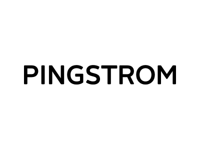
I am adjusting type to go with the product logo and could use a fresh pair of eyes for the kerning check. Anything sticks out? Thanks

I'd tighten IN a touch and widen ST just a smidgen.

I second Birdseeding. Looking good as a whole.

You asked whether something obvious sticks out? No it doesn't it looks rather fine as it is. I'd only loose /PING/ a bit to match /STROM/ better.
Thank you, gents. Will try and tweak as suggested.
Agree with all of the above :-)
Captured from web.archive.org on 19 Apr 2015. view this capture