
Who would you consider to be the finest proponents of the art of making pictures with letters and typographic nick-nacks. Thinking about those who use type, rather than calligraphers. Interested in both 2D and 3D artists.
Who would you consider to be the finest proponents of the art of making pictures with letters and typographic nick-nacks. Thinking about those who use type, rather than calligraphers. Interested in both 2D and 3D artists.

By "making", do you mean re-purposing glyphs?
By "pictures", do you mean non-textual images?

I'm not sure to be an artist, even less a finest proponent one, but I make art with typefaces:
http://www.ae-editions.com/digital-artists/frank-adebiaye/

Ed Ruscha springs to mind. Not doing arty things with type, but using type in art. Perhaps not exactly what you needed...

I don't think Si means artists whose work is exhibited in galleries (they are all crap at lettering and typography anyway, and their aphorisms banal).
I'm still not sure exactly what type of art, but here's a few of my personal favorites.
Non-Format
Áron Jancsó
Craig Ward
Yeju Choi
Alex Trochut
Michael Kim
Michiel Schuurman
Sean Freeman
Jefferson Rall
Many type specimens are art.
However, this is not the same as "making pictures with letters and typographic nick-nacks".
Type specimens tend to be more literary and conceptual creations, along the lines of concrete poetry.
It is the quality of self-reference, above all else, that makes them art.

Also, here's a construction of the Globe Theatre I did from the text of Romeo and Juliet.
http://www.jltypographicdesign.com/JLTD/Posters_files/Romeo%20and%20Juli...

.

Ed Ruscha.
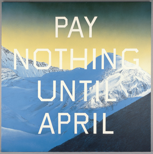
Created his own typeface called Boy Scout Utility Modern for his work.
Pay nothing until April.
It's cool that he made his own font.
But the typeface, layout and text are underwhelming.
Compare with this satirical gem by the bard of specimen writers, Thomas Mackellar:
Driftsnow, Banker
Capital Invested in Ice Houses
Good for Sudden Runs
(MacKellar, Smiths & Jordan, 1868)
That mocks commerce too, but is written with wit, skill and originality.
A poster by Peter Ewart (probably 1940s) combining beautiful lettering with a mountain view and a graphic illustration:
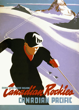
Ruscha's work employs the surrealist cliché of combining words and text that have nothing to do with one another.
The layout concept, of running a big centred title over a picture, is common in book covers, e.g. —
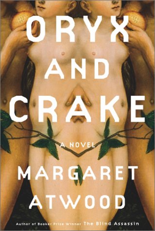
I'm not sure a wittier text and a better crafted letter would have made it better art though.
On John Cales and Lou Reeds celebration, of sorts, to Andy Warhol, Songs for Drella there's a line (I'm assuming it's a Warhol quote) in the song Images: "If you think technique is meaning, you might find me very simple".
And juxtapositioning may well be a classic surrealist cliché, but this kind of decontextualization is also something we see in post modern art and design. Peter Savilles work for New Order (case in point, the Republic stuff ) comes to mind when I see this particular piece by Ruscha.

Si, ask Bill Moran about his Types of Insects/Insects of Type book project.

http://www.google.ie/search?rlz=1T4GGLL_enGB363GB364&q=peter%20blake%20a...
althought I am not his biggest fan, some might like this stuff
these lads were pretty good also
http://www.google.com/search?hl=en&sugexp=ldymls&xhr=t&q=ancient+egyptia...
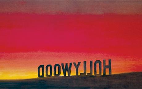
Here are some more Ed Ruscha pieces, many featuring Boy Scout Utility Modern.


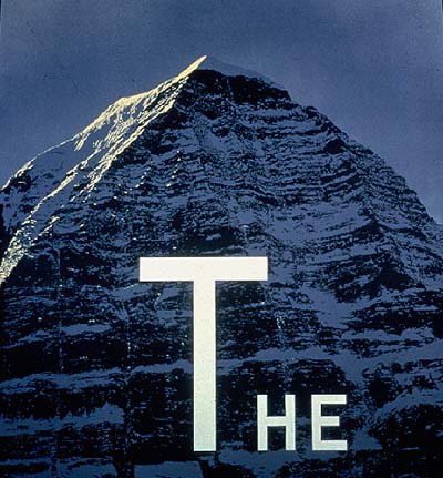
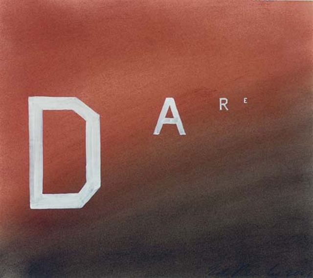
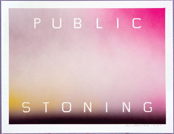


I thought you were asking about where they make pictures out of type. Googling "pictures made of type" I see this.
I remember there was a very good children's book with animals of type, but I can't find it now.
Using type-set text in a painting Barbara Kruger is one of the most famous.
nice link to Barbara Kruger
also how can we forget this
http://www.google.ie/search?um=1&hl=en&rlz=1T4GGLL_enGB363GB364&biw=1280...


They need to be still alive?
How about El Lissitzky?
then there is always good old Damien
http://www.google.ie/search?rlz=1T4GGLL_enGB363GB364&q=The%20Last%20Supp...


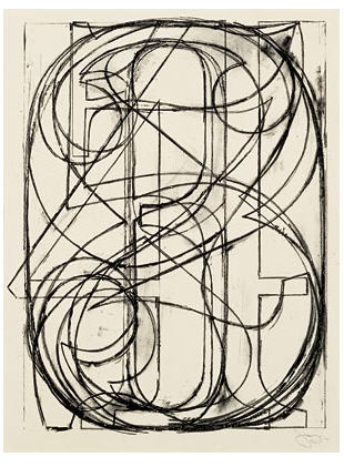
Jasper Johns incorporated type forms, especially numerals, into many of his works in the 1960s. This is a lithograph that my mother has:

Ed Fella, although it seems like he does lettering (drawn) rather than using physical or software type. I think he has some work using phototype.
Ken Lum. The photo/type compositions may be banal and poorly set, but they are funny and emotionally engaging. I can hardly criticize something that makes my soul burn.
Christian Bok [sic]. He recently did these type-as-art compositions and called them odalisques. Really, they look like playboy bunny mudflaps. But all the poets/bloggers/blogoets think it's quite exciting.
"If you think technique is meaning, you might find me very simple".
Technique IS meaning, and artists such as the Velvets went out of the way to disappear theirs, Sister Ray says, which is a technique in its own right. Isn't that what Ruscha was trying to do by designing his own "type"? That's why it is deliberately amateurish/vernacular (that, and the fact that he is no Wim Crouwel).
Andy Warhol was technically brilliant in many media, and he was an accomplished commercial illustrator before he dropped the a. One would have to say that any apparent lack of technique in his work is quite intentional, and that it does require skill to make something brilliant while looking like you're not really trying.
Damien Hirst's "nutraceutical" packaging is a terrible parody of commercial design. Bad art direction: he should have hired a branding agency to do the work, not Barnbrook, whose sensibility is far from corporate. But then, if it had looked like the real thing (see below), what would have been the point? So it's just a bad idea.
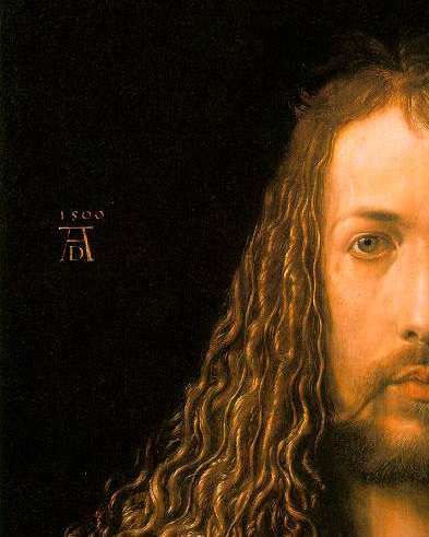
The Man …

Got to love it when companies recycle their logo to their other subsidies.

I found the children's book. It is Bembo's Zoo by Roberto de Vicq de Cumptich, whose work was linked above by Nick Shinn.
Thanks everyone for the links and ideas.
Cheers, si
Technique IS meaning
Ah, yes of course. As long as you're not showing off your virtuosity. Then it'd be craft and the discourse much too low.
More 5's…
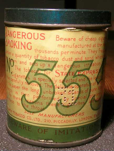

On Kawara
Jenny Holzer
Lawrence Weiner
Tauba Auerbach
Not sure these are all using type as such, maybe more lettering.
And to second Riccardo, do they need to be alive? If not then:
F.T. Marinetti, Wyndham Lewis etc.

There is also "concrete poetry", which was once very influent in Brazil:
http://www2.uol.com.br/augustodecampos/poemas.htm
http://concretismo.zip.net/
http://arvoredospoemas.blogspot.com/2007/09/poesia-concreta.html

Some recent Russian names:
Erik Bulatov;
Ilya Kabakov;
Aleksandr Kosolapov;
Andrei Logvin;
Dmitry Plavinsky;
Leonid Sokov.
Would you mean, for example, someone like John Hollander, with his beautiful picture poems such as Kitty with Bug, from Types of Shape?
for those interested - a wonderful book about the subject - Simon Morley's "Writing on the Wall: Word and Image in Modern Art"
Captured from web.archive.org on 17 Jul 2012. view this capture


