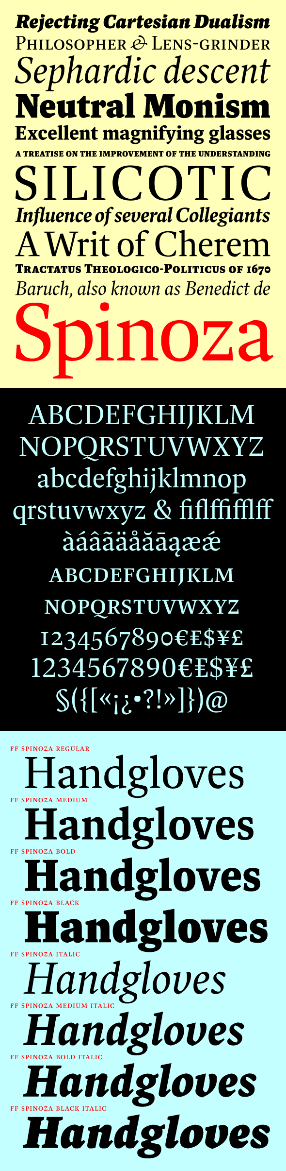
After 11 years, my first text typeface has finally been released into the wild. FF Spinoza was designed to be an elegant workhorse: crisp, sturdy, economical, and versatile. A classic and highly readable Antiqua, it has compact proportions and a generous, though not exaggerated, x-height and aperture. Robust thin strokes and pronounced serifs and terminals make it suitable for setting in small sizes under challenging conditions, both in print and on the Web. Abruptly tapered junctures keep characters sharply defined and, in the heavier weights, create enlivening light traps. Its curves are subtly faceted, with extra corners and unexpectedly straight edges that add interest in display sizes and energy in text sizes. FF Spinoza includes a comprehensive set of diacritics providing support for more than 70 languages, from Afrikaans to Zulu. The Pro version supports more than 130 languages.
Available at FontFont.
Download a specimen booklet here.