Typophile

1960's Display Fonts...

jim89

I'm putting together an interactive timeline of British music in the 1960's for a University project and I would like to find 10 different display fonts to use in the title for each year. I was thinking of typefaces like Cooper Black, Pump Triline (though that may be more 1970's) and Decorated (451?)

Any suggestions are welcome!

Jim

Did you do a google search? if not, try it! they have lots of free and commercial fonts fron the 60s.

They who?

What kind of music?

Its a YCN competition brief for the British Music Experience in London. I'm producing a flash timeline which targets some of the highlights of the Decade, The Beatles, The Rolling Stones, The Kinks, The Who, and the like.

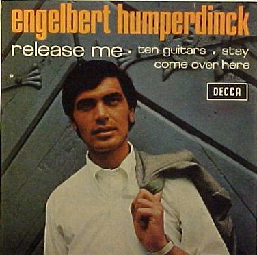
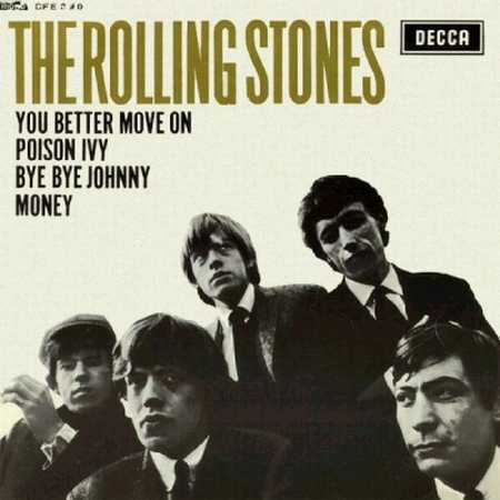
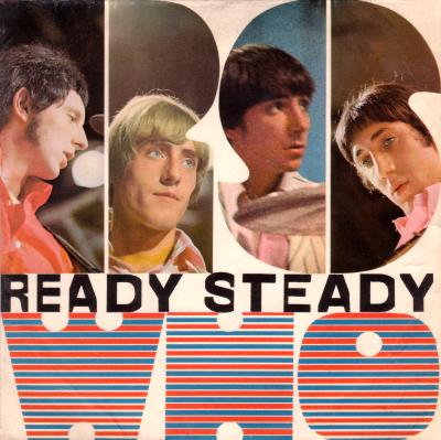
If you have a set list of bands, why not draw inspiration from their album artwork?

Louis Minott's Davida (1965).
Neo-Victorian, capturing the exuberant "display" that saw mods adopting Regency, and hippies Victorian military styles, eg in Sgt. Pepper, and recolouring them.


Everyone used Compacta, or some such thing.


1965: Pop art. The stencil effect could be Futura Black. Fun to break up the colouring.
By the same token, bouncing was big at the start of the decade.

Captured from web.archive.org on 14 Oct 2013. view this capture