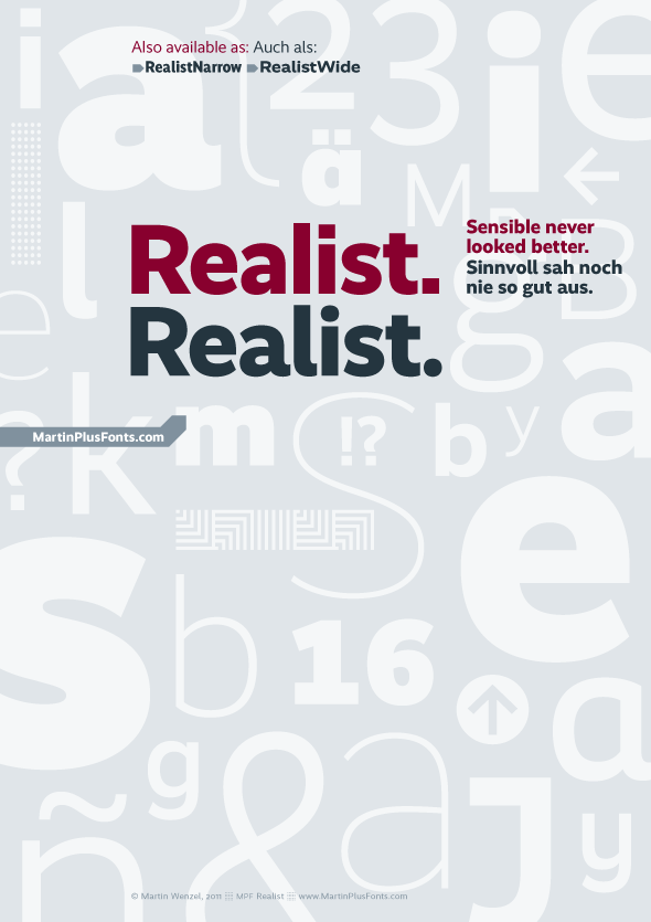
Very nice. Clean and very legible for a grotesque. Also, nice range of weights and styles.
Your web site is also very functional and attractive. Good luck!

Very nice. Clean and very legible for a grotesque. Also, nice range of weights and styles.
Your web site is also very functional and attractive. Good luck!
Impressive Martin, well done!
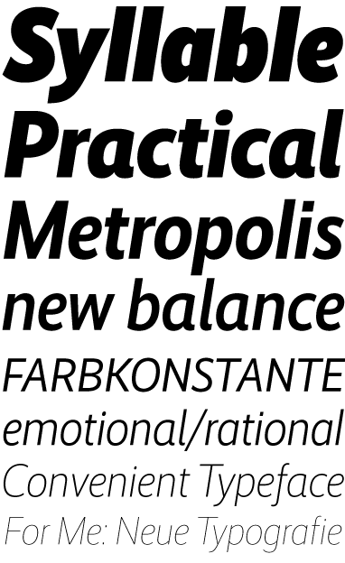
Next stop: italics..? ;)
Hi Alex, thanks.
Paul, thanks to you too.
Italics? Totally overrated ;-)
Really handsome and clear. It stakes out a nice territory between grotesque revivals like Founders Grotesk or FF Bau and more humanist workhorses like Gotham and Museo Sans. And I love those Op Art borders.
On page 3 of the Realist specimen, is that the wrong /g/ on the 4th line, style 1 and style 2? Or is the PDF correct?
And, hey, I just noticed that there are four /a/ variations on this page!
Hi Tilman,
I'm afraid that my specimen PDF is not faulty :-P
The idea is that the user can combine two Alternate/Style setting to access the variants in this typeface.
Alternates / Style 1:
By choosing Stylistic Alternates (in Illustrator for example) or Stylistic Set 1 (in InDesign) you’ll get round punctuation marks and alternates of "I", "a", "b", "g", "i", and "l".
Style 2:
Only choosing Stylistic Set 2 will give you access to an alternate "a" as well as "y", upright italic designs if you will.
Alternates / Style 1 + Style 2:
Combining both styles will give you the same alternates as in Style 1 but with (humanist) upright italics for "a", "g" and "y".
> Italics? Totally overrated ;-)
No winkie needed.
hhp
(I'm not sure if anyone will read this very late answer)
Yeah, I've just finished the RealistNarrow Italics :-)
http://www.martinplusfonts.com/realistnarrow/index.html
Paul, next stop: RealistWide Italics :-)

Captured from commoncrawl.org on 21 Apr 2015. original URL