Hi All,
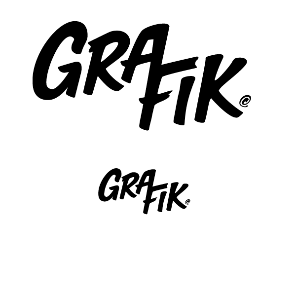
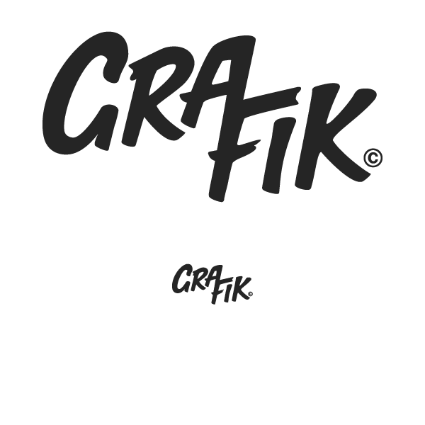
I am reworking my companies logo and would love some feedback.
Inspired by the Gralab logo from the 70's, I am trying to create an aesthetic that can make my logo memorable, fun and classic.
I'm fairly happy with the logo at this stage, but I'm not sure the uppercase 'G' is really working and would love an opinion /advice on any of the other letters.
Thanks in advance.
Nick
| Attachment | Size |
|---|---|
| Untitled-1.png | 7.58 KB |