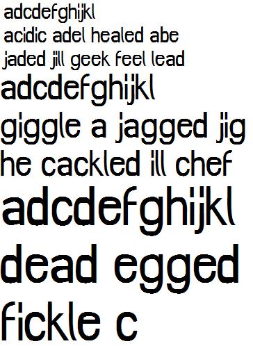
Hey, Typophile community, this is my first post here(Oh goody). I've been doodling these glyphs on and off, finally made an alphabet and a digital rendition. These haven't been vectored, or anything near it yet, I'm primarily working on letterforms right now.
Suggestions and crits? I'm very new to this, I've made one font prior to this and it was somewhat a disaster. So, this is my second font in the works. Cheers to this being better than Vaguely Fatal.
Uppercase draft(Blue is possible revision.)
http://i51.tinypic.com/35ddmxl.jpg
Lowercase draft
http://i55.tinypic.com/j7xaur.jpg
I'm very open to suggestions/critique! :)