
Hi guys, I'm new to this website and was wondering if any of you could give me some feedback on a logo I've worked up for a design agency. Thanks.
Hi guys, I'm new to this website and was wondering if any of you could give me some feedback on a logo I've worked up for a design agency. Thanks.

I like the typesetting. The tagline is a little hokey, but looks nice.
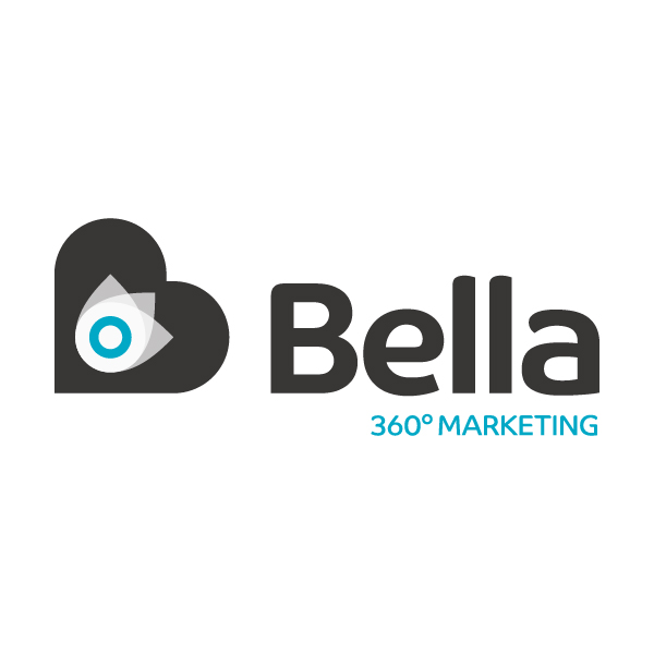
The mark is nice, but seems superfluous. There's also a lot going on...heart...target...flower...
Thank you for your comment. I was trying to incorporate a letter B in to the design by using the rotated heart. The centre is meant to be an abstract eye using a droplet shape plus a scaled up version of the degree symbol used in the strapline.

I think that heart-flower thing is way too complex/layered. And you have to worry about the "bone effect"* where the straight lines connect to the curves.
* http://66.147.242.192/~operinan/2/2.3.2a/2.3.2.06.illusion.htm
BTW:
http://www.wsignco.com/IMAGES%208-08-08/JPEGS/Burlington%20Coat%20Factor...
hhp
Captured from commoncrawl.org on 19 Apr 2015. original URL
