
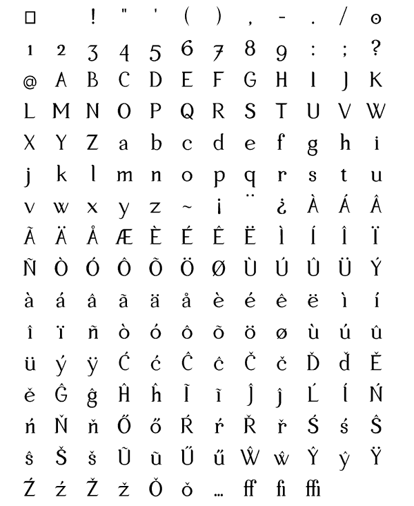
I've been working on this serif typeface, which I call Mikael, since the beginning of this year and now I would like to get some critique on it.
| Attachment | Size |
|---|---|
| Mikael_Regular_Sample.pdf | 34.27 KB |
I've been working on this serif typeface, which I call Mikael, since the beginning of this year and now I would like to get some critique on it.
| Attachment | Size |
|---|---|
| Mikael_Regular_Sample.pdf | 34.27 KB |

I like it! Perhaps you can post a PDF with some text (Lorem ipsum)...?
The contrast in /A/ is the wrong way round (rotate /V/ 180 degrees).

Yes I second Jean. Provide a PDF because your image is rather small and blurry. We could see letters bigger in a PDF. With or without actual text for starters.
I have now put a PDF as a attachement to this topic.
http://typophile.com/files/Mikael_Regular_Sample.pdf
Jean - I will try to change the contrast of the A to see if it looks better. Thanks for the feedback.
I can see that you've put lots of work into this so please consider this a positive critique even though I think (know) this font face has lots of work to do:
I'm not trying to put you off, but at this stage and looks of your letters this seems like a dead end project. You may learn a lot while doing it but you will either redraw it considerably to make it at least usable or start a new one after you gain some more experience.
For a beginner it's also usually better to go with a sans serif first because it's... well a bit easier (not a rule but usually is that way). Designing serifs with contrast stroke and not thinking of drawing them with a broad nib pen makes it even harder to succeed.
So. The main thing is I encourage you to continue, because you obviously like doing this (since you've devoted so much time to it already). In time and after few/many corrections/redraws you will become better and better and may eventually create something that will be usable in a designer sense of way.
(but who am I to judge since I'm not a formally educated designer at all even though some may've thought I am).
Captured from web.archive.org on 27 Apr 2015. view this capture