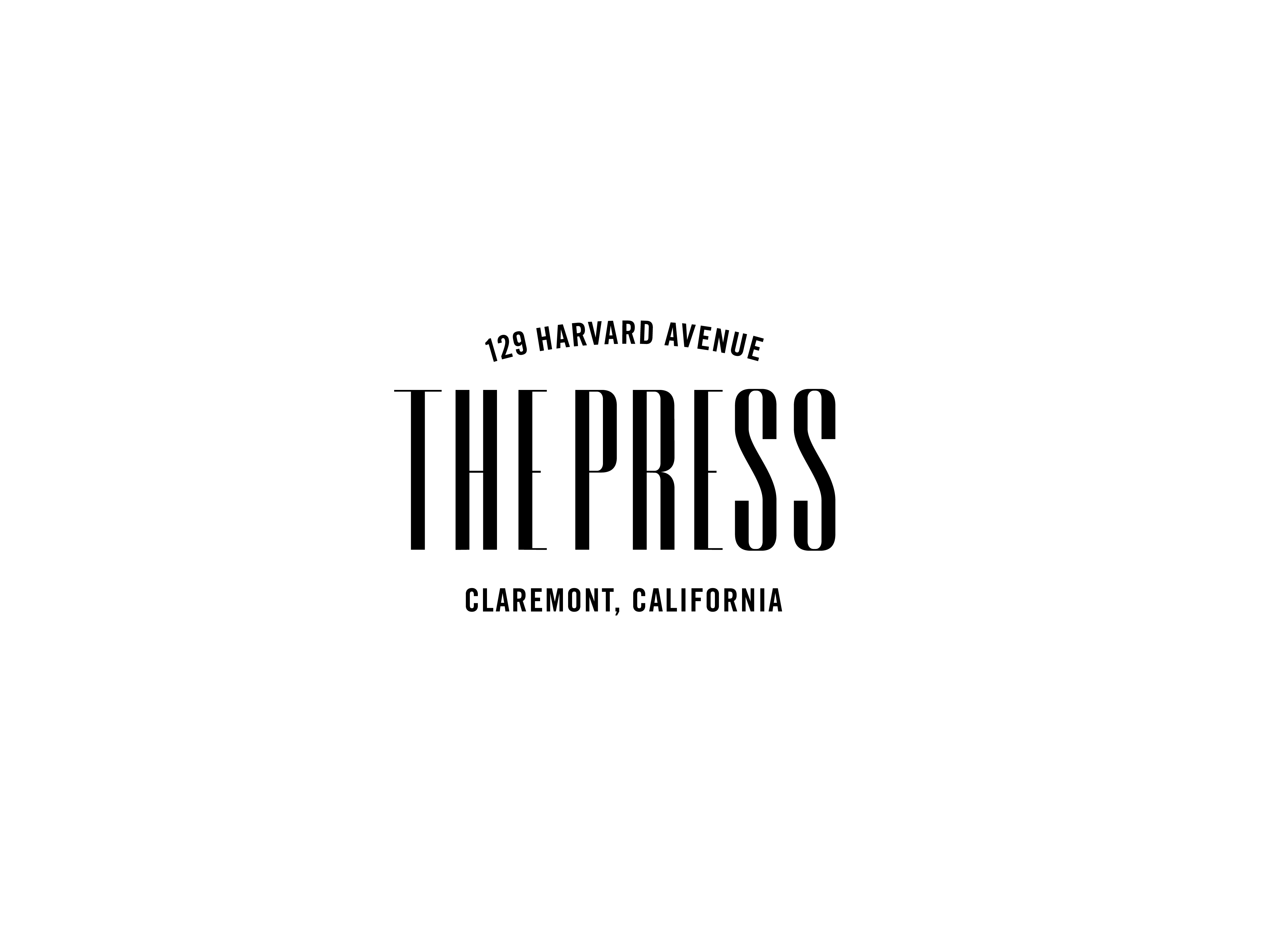
This logo i created is for a restaurant, here are my keywords: 1920's, class, jazz, new york signage,wine
| Attachment | Size |
|---|---|
| press-01.png | 82.9 KB |
This logo i created is for a restaurant, here are my keywords: 1920's, class, jazz, new york signage,wine
| Attachment | Size |
|---|---|
| press-01.png | 82.9 KB |

I suppose it works with your keywords very well.

Optically it feels like there is more space between THE PRESS and CLAREMONT, CALIFORNIA than the top line.
yah i see what your saying, my negative spacing needs a little more love
Captured from commoncrawl.org on 19 Apr 2015. original URL