
Typophile
Untitled Slab Serif

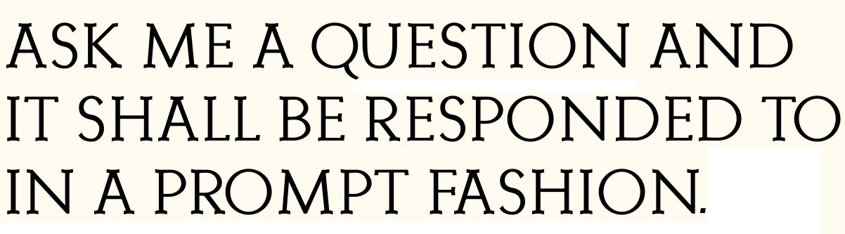
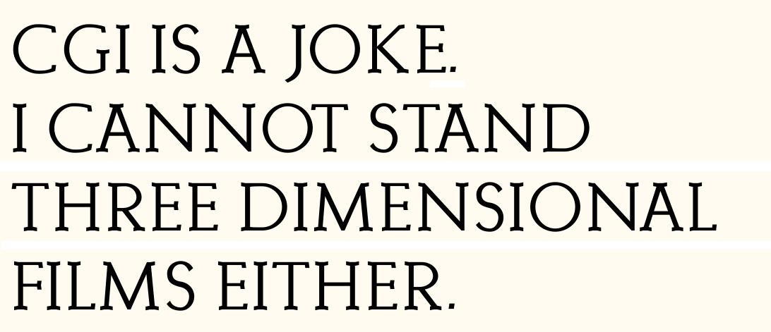

S, Q, and K need some work. Any lowercase?
I'm considering just caps and small caps.
Haven't touched the kerning yet...
thanks TB i'll look at them

R look a bit like it’s making a curtsey. But it could be a stylistic choice.
riccard0 - haha I can see that
TB - I just posted a bold version - you are right about the 's' - needs a lot of work

Captured from web.archive.org on 27 Apr 2015. view this capture