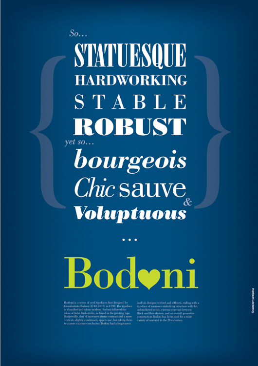
I think the words look cool. My two cents: I reckon the braces are too big and the extrusion of the Bodoni is too deep. Also, maybe try a shallower 3D perspective so the Bodoni is less distorted...
Peter
Im doing a set of posters on Bodoni.
Trying to highlight its versatility by associating
some words with it and typing them in different styles of Bodoni.
A draft of what the first poster will look like. Containing all the words.
Then I'll dedicate one poster to each word visualizing the word in a real environment.
What do you think about it?
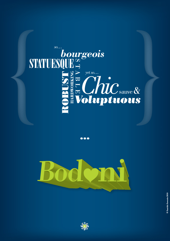
I think the words look cool. My two cents: I reckon the braces are too big and the extrusion of the Bodoni is too deep. Also, maybe try a shallower 3D perspective so the Bodoni is less distorted...
Peter
I think you'd better not use the extrude effect, as it looks rather cheap IMHO. I also don't think it fits the spirit of Bodoni. I like the heart though. The braces could do without the gradient. I would try to make it simpler yet more graceful. The words themselves and the treatment is nice, but perhaps the overall arrangement and the colour needs more work.
Ya even I thought I'd scratch the extrude effect. Working on it. Thanks :)
Get rid of the pea green 3D Bodoni, the symbol at the bottom, and the "so..." and "yet so..."
@Trevor
3D - Understood, will remove that.
Why do you think "so…" and "yet so…" need to go?
The symbol at the bottom is my logo so it can't go since
this is my classroom project.
Do you think this arrangement looks better?
It lacks character though, the previous one
has an interesting path for the reader.
Will change the dummy text later in this one below the green Bodoni.

Reading more closely, I have to say I find some words not fitting with Bodoni (Robust, Hardworking). I think the new arrangement is blander than the one before, as it all becomes very boxy and symmetrical. If this is a print poster I would probably ditch the gradient, as it looks nice on screen but often cheap on paper (especially shiny paper).
I would definately try some different colours, and ditch the green... Concentrate on the arrangement in black and white first, then see which colour would fit. Personally I would go for a more classical colour scheme (white, red, black, perhaps some silvery grey), more fitting with the work of Gianbattista Bodoni, but try to find a way to give it a contempory touch, for instance by working on a nice type arrangement.
Agree completely with Queneau on the traditional coloring (white, cardinal red, black). If you can, get to a Taschen store and look at their gorgeous reproduction of Bodoni's Typographic Manual.
I would maybe replace the word "Hardworking" with "Elegant" or "Timeless."
Hey thanks you guys! I understand the color part. Thats what I was trying to do - to give it a contemporary touch.
There wont be any gradients and yes it will be in print. Will try to look for the manual. Though I have managed to get my hands on a prehistoric edition of Manuale tipografico del cavaliere. :)
You probably want to spell “suave” correctly. (Not “sauve.”)
Cheers,
T
Versatility?!
Try this on for size:
"Bodoni would be an admirable letter for a death notice." -Ovink
hhp
Thanks for clearing that up T.
@hrant
Are you suggesting something in my project's context?
or is that just a statement?
1) It's not versatile.
2) Try stuff like "FRIGID". :-)
hhp
I think you should include the words Elegant, and Timeless. Definitely apply more than Robust, Versatile and Hardworking.
Im not using Versatile or Hardworking anymore.
Don't you think the Poster Bodoni by Chauncey H. Griffith is Robust? (The way robust is typed on the poster).
My cup of tea: I think the <3 is quite too modern, funny and "Glaser" for Bodoni, which should be promoted in a more mannered way.
I also think you should work more on the Chic - sauve arrangement, the x-height difference is a bit too rude.
Of course this is just my own opinion so feel free to throw it in the rubbish :P
I think what you pointed out makes sense
The x-height difference is very awkward.
Don't you think the Poster Bodoni by Chauncey H. Griffith is Robust?
It’s not Bodoni just because Bodoni is in the name. The same goes for that narrow face you used.
As well you never looked at Manfred Klein's Bodoni-based faces. The result would have been quite unutterable.
The main characteristic of Bodoni is that it’s not Hobo ;-)
http://www.youtube.com/watch?v=lNuo_-1ZjfI
Although the Hobo is video is hilarious :) I want to keep these posters a little less humorous.
@DTF: Agreed that it was designed much later and that too by a different person but it still follows the basic structure and the extreme stroke contrast right?
@Te Rowan: I just checked out those Bodoni based faces by Manfred Klien. Im not using those for this project.
As I said... Quite unutterable... Look like they got bit by a werewolf, then et alive by a werebear. 'Cept maybe Bodonitown. That one's kinda sorta nice.
Hehehe true at first I thought you were praising them :S.
Captured from commoncrawl.org on 25 Apr 2015. original URL