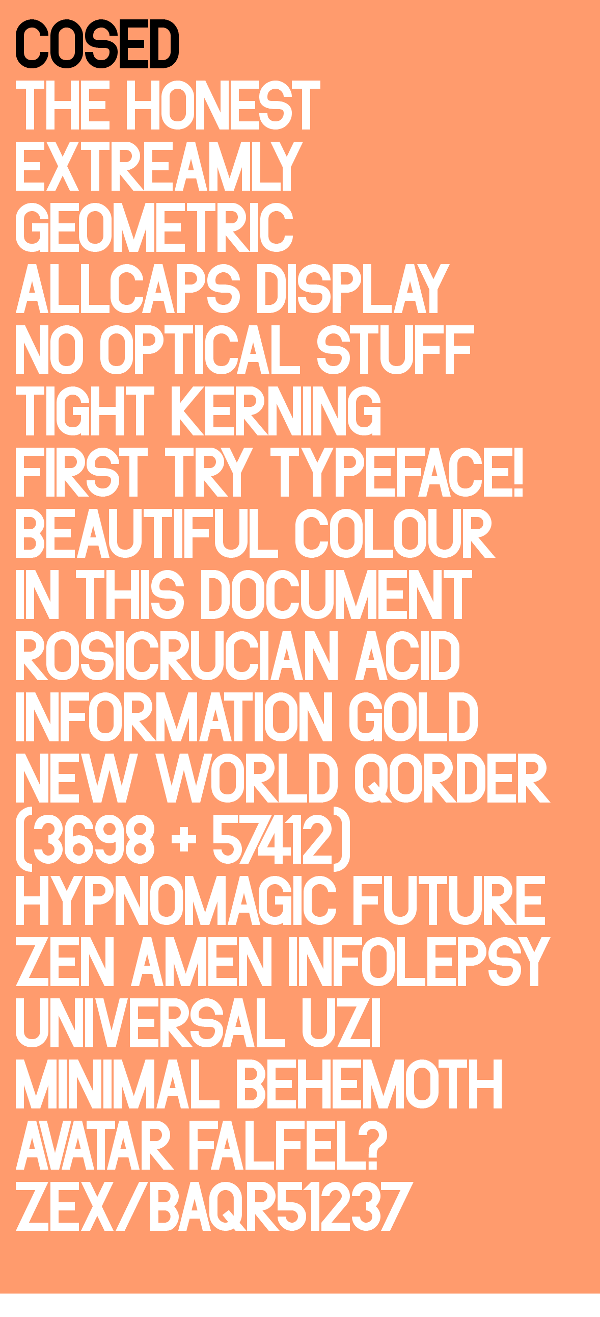
So, it´s almost a year ago, when I started to discover type that I made this fist typeface. At the time I had discovered the optical tricks used in professional typography, and though I understand the importance of it, it kind of annoyed to see the skewed geometry when used in big sizes.
I also just wanted the experience of designing a font without knowing anything really, I did not even know about DIN at the time, Helvetica(I discovered condensed later on) was my only mental reference point, but I did it all in isolation. Now I have not showed it anywhere on the internet since I thought that there are probably already a precisely similar font since it is created from such simple design principles. And I am still sure there are at least as drafts on designers hard drives. But it turns out after a year of looking at typefaces I have not the exact same idea replicated, not with the honest simple geometry and default tight kerning. But there is DIN and Helvetica Condensed and UNIQLOs version of DIN... If you know of other ones I would be happy to know!
But the question is, do you like it? Could you use it? Would you buy it? Is it useful?
What are the problems? I know the S is strange and the R is also a bit... but I have grown to like it...
What I especially like, which seems to be rare is that the middle lines are all the same. But I know the basic argument against it.
I do not claim that it even is a real typeface, it does not have the versatility etc, only a small set of characters. But I think it is kind of fun, and maybe even a bit unique, but in a good way?
So what is it, aggressive, neutral, boring, clunky, horrible, technocratic, fun?
| Attachment | Size |
|---|---|
| COSED-2.png | 74.13 KB |