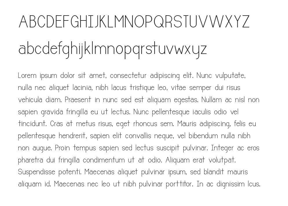
Hey everyone. This is technically my second font, but I'm a newbie by all means.
This is a rough look at what I'm working and I would love some basic feedback especially for any pitfalls that I should avoid now and in the future.
Enjoy.
I realize that the spacing isn't perfect yet. also if the image is too small to critique let me know and I'll post a better sample.