Typophile

Checker

Nick Shinn0 votes

Checker is an all-cap ‘3-D’ display font which automatically alternates positive and negative tiled characters, by means of the Contextual Alternates feature.

Checker is an attention grabber suitable for logos, titles and short headings. With its tiled construction, it’s a natural for colorful interpretation. The letters are properly italicized and back-slanted, and adjusted for maximum readability within the constraints of the font’s concept. The letter style is bold grotesque, so Checker will mix smoothly with any other fonts in a layout.

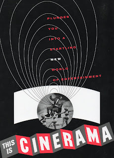
After I had completed the typeface, I came across the old Cinerama logo (1952-1974), which has some resonance. When working on the face, I was aware that I was channeling nostalgia for a kind of counterpoint layout that was popular in the early 1950s, involving bold type and large areas of spot color, without referencing anything in particular. Memory and imagination have interacted to bring a half-grasped style, exotic in its vague recollection, into sharp reality, further informed by themes explored in recent work:

Contextual Alternates (it's my fifth typeface to explore this OpenType feature), monowidth (Panoptica, 2005), ambiguous perspective (I spoke on linear perspective at Typo Berlin in 2009), extreme italicization (Figgins Sans Italic is at 20°), and the tension in readability between letter perception and word perception (an issue much discussed at Typophile).

—Nick Shinn

Related, an essay at I Love Typography: Engaging contextuality.

Available at MyFonts.

I love it! And totally unexpected after the Modern Suite and Sense & Sensibility.

Cartoon Network should remake their logo with it! ;-)

Fun! Is that third image showing how it responds to squooshing?

Yup.

– What comes next?

I am delighted.
Compliments, Mr Shinn.

Thanks.

What comes next?

Something quite different, as usual.

Nice job Nick. Checker belongs to one of my favorite categories of fonts, the "Victorious Underdog": it starts from an unlikely or oddball concept, and then, through sincerity and hard work, wins you over.

Sorry about the atrocious lighting. This original Cinerama signage has miraculously survived near the corner of Sunset & Vine in Los Angeles, near where I live.

Coincidentally it's right next to the former site of my greatest contribution to LTypI.

Now that I've done some googling of the Cinerama logo,it appears that an awful lot of liberties were taken with it -- this one, for instance, is the first I've seen which has this kind of "Copperplate Gothic Square" lettering.

I had thought about doing variants of Checker, like a version with all solid tiles, but decided against diluting the concept.

Looks like a fun font for posters and logos. I think I'll be getting this to play around with.

I had though about doing variants of Checker, like a version with all solid tiles, but decided against diluting the concept.

One possibly useful variant I could envision would be a "reversed" one: outlined "ascending" tiles and solid "descending" ones.

I notice that, in addition to the redrawing you discussed on ilt, you emboldened the white letters to counter the "eating-away" effect of reversed-out text. Nice attention to detail (as always!).

I must confess that wasn't the reason: thing is, the keyline takes up some space on the white panels, so I had to make the black letters a touch shorter so they wouldn't be too tight to the line, especially for squeezing in the accents!

Nick, I hope you're planning to make this a "Featured Face" here at Typophile. It'll look great atop the forums!

It wouldn't work, because Contextual Alternates is not supported.

Well, it would work iF EvErYbOdY TyPeD ThEiR SuBjEcT LiNe lIkE ThIs.

Lummee guess... you can't slip a sTuDlYcApS filter into the title-generation toolchain.

Lummee guess: You can't slip a sTuDlYcApS filter into the title-generation toolchain.

a "Featured Face" here at Typophile.

yeah!

Well, it would work iF EvErYbOdY TyPeD ThEiR SuBjEcT LiNe lIkE ThIs.

:o) nO pRoBlEm!!

You think I should give it a try and see if people play ball, or would it just piss everyone off?

I would very much like it. But since the featured font is applied to any title, past and present, it would mean a lot of black parallelograms. And weirdly cased titles when the font will change.
You could set some of the current titles to see if they give justice to the typeface.

Nice job Nick.

I notice that, in addition to the redrawing you discussed on ilt, you emboldened the white letters to counter the "eating-away" effect of reversed-out text.

It has been my experience, in developing the Positive and Negative Contrast ClearviewHwy fonts, that the opposite of what you point out is necessary.

It is not the white that has to emboldened, but the Black to hold back the lighter background

Interesting! I wonder if it's the intensity of the color coming into play there, i.e., perhaps the emboldened black is holding back not the lighter but the brighter background.
Here's your image in greyscale.

What do you think?

James is correct, this principle is well known in signage (FF Info, for instance, IIRC, provides differently weighted versions of the same "weight" for positive and negative use).

It is further complicated by the issue of reflective vs. backlighting.

In this thread, I made my specimens in Photoshop, and was more concerned with getting the colors to work well with one another, than preserving the absolute weight of the type. Two Photoshop actions affected the weight:
Firstly, the choice of type antialiasing mode.
In the following sample, it goes Smooth, Sharp, Strong, from top to bottom.

Secondly, I used the paint bucket (Fill) a lot, and again, the anti-aliasing setting came into play, eating into edges.

However, even recognizing the effect James mentions, I'm not sure it would apply to Checker, because it's debatable, for a particular character, whether the letter or the tile is the figure or the ground. That's particularly apparent in the first specimen at the top of this thread (with the black and red check background), where the yellow negative tile space behind the black letters really jumps out much stronger than the yellow letters.

The role of the border and background plays a significant role in the viewer's perception of the type in a sign; in James' specimen above, there is:

- Ample space between type and frame
- A keyline around the frame
- A grey background

These all serve to focus attention on the weight of the type.

In my specimen immediately above, the absence of a keyline around the solid tiles makes that setting recede, weaker, so the other style, black lettering on "white" tile, does not need to be emboldened to hold its own.

Captured from web.archive.org on 16 Jul 2019. view this capture