Typophile

Rounded square font

vilbel

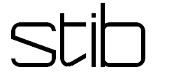
Hello, I am currently working on my first real typeface. I would like some advice, especially on the /t/ glyph.

Of this three versions, I think the first one looks too tiny compared to the other glyphs. But what about the others? Should I raise/lengthen the arm?

Also, this is the full glyph set (as of now):

Any help would be greatly appreciated!

-Thijs

The slanted crossbar looks wrong no matter how you position it; if you must use the angled approach on the t, why not apply it to the bottom of the letter?

Thank you for your reply, you mean like this? (Excuse my rough draft haha.)

Or the other way around? But you're probably right, the slanted crossbar (isn't it a rotated crossbar, technically?) doesn't look right. Maybe I'll just stick with a simple straight one. How does it look on the /e/ and /a/?

In any case, usually the right part of t's crossbar reaches the x height.

Actually, this is more what I had in mind...

Ahah of course. For now I think it looks a bit out of place between the other glyphs.

It works better with the f I have in mind, too. But thanks for your help guys, I still have to learn a lot about t's.

Think I'll go for the third one, and use the first one as a capital.

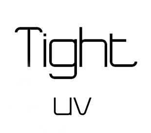
That's what I've got now. I would like to hear your opinion. Is it a bad idea to use a different approach for v and w?

Also, I'm trying to apply (flat) kerning in fontlab, but it doesn't show up in the quick preview or the generated .ttf file. What am I doing wrong?

Hi,

I made another capital /T/ and another lowercase /v/.

Gr Jeroen

Captured from web.archive.org on 18 Apr 2015. view this capture