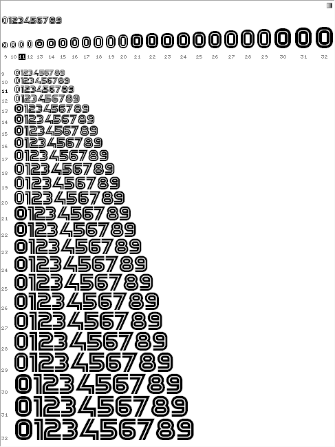
So a couple of years ago, I made my first font, Yagi Double. Then I wanted to hint it, got scared when I saw the amount of work involved. Now I'm ready to try again but it STILL seems too tedious, like I'm missing something. What I've read so far on the subject:
http://www.rastertragedy.com/
http://scripts.sil.org/cms/scripts/page.php?site_id=nrsi&item_id=NotesOn...
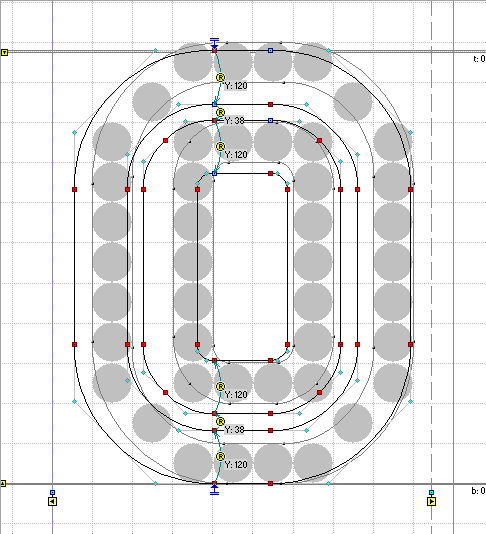
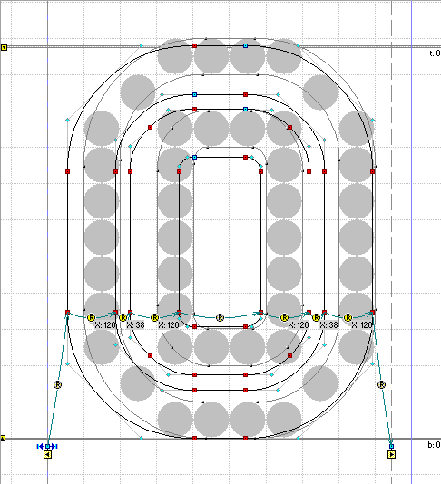
As I understand it, you come up with an array of numbers representing the location of stuff like the baseline, cap height, x-height, etc. You feed these into two different areas in Fontlab. With an inline font like this, there are twice as many of these numbers. It's a lot of hassle.
1. Does this really produce good hinting results at the end, if I could force myself to do it properly?
2. Is there no way I can just manually edit the post-hinting outline for each letter? Like drag the vector points around until they neatly box in the pixels? I can SEE this outline on the screen, but I can't seem to manipulate it. Is it unrealistic to think I could just manually tweak 52ish characters for every font size between, say, 8 and 18 points?
3. If I can't do it this way in fontlab, can I somehow do it in illustrator and import the result into fontlab, like "use this vector outline as my 8pt version of zero"?
Any advice is appreciated.