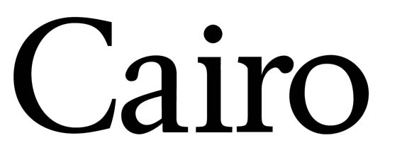
I wanted to take a classical garalde, flatten the serifs, and open the apertures a bit to create a more contemporary, 'Egyptian' style text face, almost like if Galliard and Clarendon had a child. This is what I came up with:
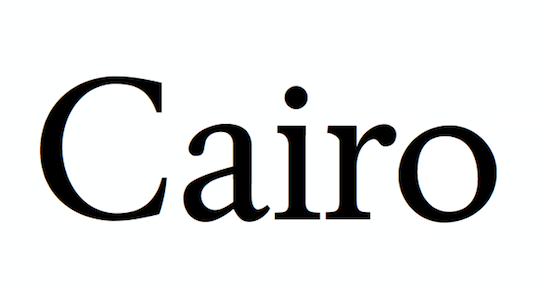
Right now I have just a few glyphs, but before I keep going, I wanted to check with those whose opinions I value so highly: Typophiles. Do you think think it's worth pursuing?
| Attachment | Size |
|---|---|
| Cairo Specimen.pdf | 5.47 KB |