
Not sure about this, so I'm hoping to get some constructive feedback here.
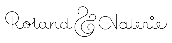
Not sure about this, so I'm hoping to get some constructive feedback here.

In Valerie, I read the 'V' as 'N' and the 'r' as 'n' initially.

I agree with Aaron. Maybe the circle above the 'i' should be slightly (and only slightly) smaller? Apart from that I quite like the feel. It's romantic and modern.
Thanks guys! Is this better?
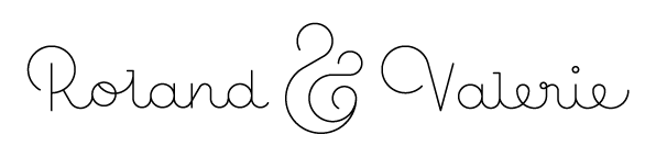

It's much better now. The only thing I don't like is Roland's n which I think should match the a and d more.
Changed the n, but also changed the V back to its original tilted version (though slightly adjusted) since I feel it works better in the total design.
I used some fleurons I made about a year ago to add a little elegance while still keeping it very simple & clean. Also played with 2 different stroke weights to add a little depth.
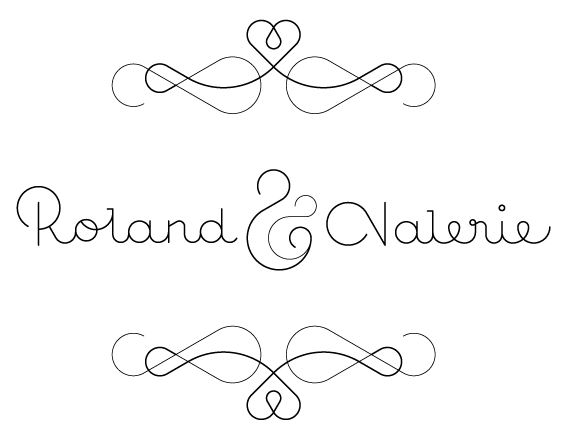

I think the ascenders on /l/ and /d/ look a little stunted relative to the rest.

Try moving the circle part of the V higher up - it might make the V less N-like; maybe match it to the height of the R. Overall it looks great! Love that ampersand.

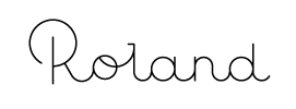
Maybe you could lighten the swash of the V, like you did in the ornaments. Personally I don't like the first n in Roland. Noone would actually write it that way. The second one is much better. Also the o is a bit elevated, was this intentional?

The ampersand looks like it has a baby. It's not proper to formally anticipate childbearing, especially even before the wedding!
hhp
I actually had to abandon this approach. The initial 'carte blanche' I was given had to make room for an idea from the couple to be wed. They found a text online they want to use for the invitation & want the design to match it. The text is something along the lines of 'the front door is still the same, but inside something has changed'. They now want that to feature on the front of the card along with a picture of a door (preferably having the card itself resemble the door) :-S

Oh yes. Good idea! Double flapped card. It will be hard to make it so the "doors" will align perfectly, but it would seem really good. You'd then open up with all the wedding info inside.
Really nice but hard to create.
Just make sure that you open a new thread because it won't have anything to do with this custom lettering that this thread is for. (actually if you'll need a thread for it).
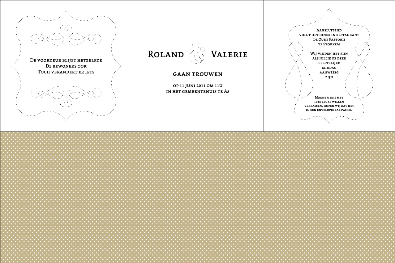
Since I wasn't happy with the door idea, I made a different proposal first that they liked. I ended up leaving the typography to the experts & only used the ampersand & fleurons in the final design.
It's a three-fold in B/W with a coloured patterned back.
Is heel leuk geworden maar ik moet zeggen dat ik je oorspronkelijke logo het mooist vind!
:-)
Dankjewel! Als 't een troost kan zijn heb ik 'n aantal letters van 't oorspronkelijke logo nog kunnen recupereren voor 'n vriend ;-)
Captured from web.archive.org on 25 Apr 2015. view this capture