Typophile

Exotique

Hello!
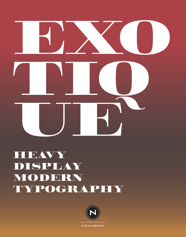
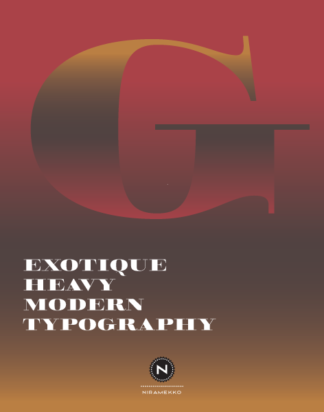
I'd like to share and get feedback on a set of capitals I have designed for a client work, maybe it will see the light of day as a font. I'm calling it Exotique, and it's a Modern Display Serif. It is made to be seen at big display sizes.

Cheers and thanks!
Rodrigo

AttachmentSize
exotique1.png28.49 KB
exotique2.png18.38 KB
Exotique 2011.03.24.pdf286.5 KB

I like it. It reminds me of something, but don't remember what.
I'm not sure about the detached tail of Q. In your sample it seems like a tilde falling off the E...

Other than all other modern serifs : ) i designed it inspired by andy mangold's Pompadour numbers (which are beautiful). It does not resemble it 100%. But that could be it.

I quite like the detached tail of the Q, but I do see how in some contexts, with different leading etc it could look a bit odd and less readable. I'm not usually fond of the high contrast Q and its tail (see: Ambroise, Bodoni, Walbaum) but this works.

Thanks Matt, Maybe some alternative glyphs on the Q would be a nice feature. And I'll look into that!
I totally dig the high contrast tails :)

Captured from commoncrawl.org on 25 Apr 2015. original URL