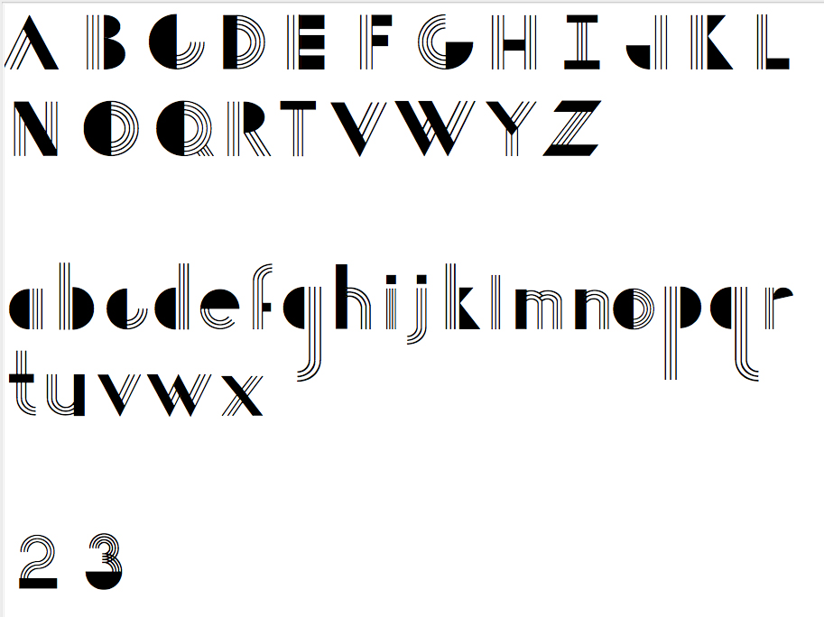
I need some expert opinions on this typeface. They started off as a drawing for an assignment but I’m now using them to learn FontLab and have decided I might as well see them through to the end!
They are just preliminary for now---an exploration of how to combine lines and shapes to form an esthetically pleasing glyph.
Below are specific questions, although I do have opinions of my own but would like to hear what others think.
3 lines or 4 lines, and space or no space between lines and solids? As with L/C g, d, q, capitol K, E etc. (I think it would look best to go with 4 lines and leave no space between lines and solids…)
Between upper & lowercase, should the line weights be the same mathematically or should each case have it’s own particular line weight to balance visually?
When it comes to some of the solids should they be consistently the same thickness? (E, F, I, T, L, etc. -- horizontally and/or A, N, V, W, Y, etc.-- diagonally) This is probably a stupid question, I'm sure they should be the same but is there wiggle room? And lengths as well, such as E & F for sure but then what about the horizontals on T & L? Same as E & F?!!!
Should ALL diagonals have the same angle? I think yes but hard to match all characters with diags--some look better slightly changed. Is this something one needs to juggle?
When scaling down a cap, naturally the strokes change. I’m guessing that I shouldn’t be copying caps and scaling them but rather I should start from scratch for L/C letters? (refers to question 2)
Would the descenders be better shorter as in F & j or longer as in g, p, q? I’m thinking shorter.
Anything else?
Any advice appreciated!
Thank You.
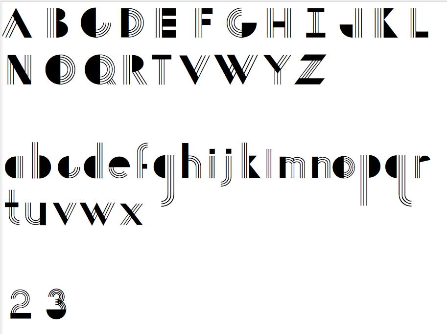
(The attached file is larger)
| Attachment | Size |
|---|---|
| bifurstyleLG.jpg | 239.02 KB |