Devout readers will recall my numerous bug reports about Typophile. Quite a few of them argued that Typophile should do what is known to work and not do what is known not to work. A great deal of knowledge about what works comes from MetaFilter, the community Weblog that is the model for such things. It’s more of a success than any remotely comparable site – 11 years old, 70,000 active users, a million pageviews a day; profitable; employs four people in tech development and moderation; moderated 24/7; includes the most important feature of all, MetaTalk, a forum to discuss MetaFilter itself.
Now let’s talk about typography. Logged-in users can choose the “classic” white-on-blue configuration for MetaFilter proper or white-on-black. My query is not about page design or colour choice, so don’t derail onto those topics, please. What I take issue with is MetaFilter’s uncontrolled line length.
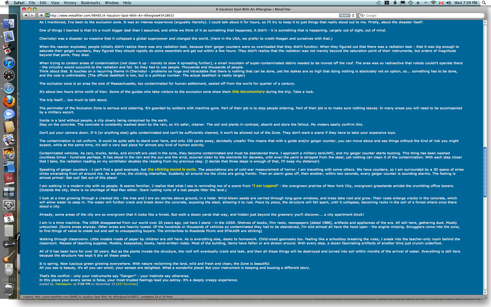
It’s very simple: Lines are as wide as your window. Attached is what MeFi looks like on a 24″ monitor (Flickr version).
Everyone here knows this is insane. You cannot read text that wide. In the past, it has been impossible to get the ordinarily quite intelligent owner and developer of MetaFilter – mathowie and pb, respectively – to understand that measure is actually a problem, let alone do something about it. All it needs is one declaration in CSS (max-width on the appropriate div).
pb will not even add a unique id to the div in question so that, in a last-ditch effort, one could set up user CSS in one’s own browser to do the job. (Nobody should have to do that, but they refuse to make it possible.)
mathowie and pb seem to believe that every aspect of the appearance of MetaFilter is a component of its success. Changing anything amounts to tinkering with what works. That belief comes from a misadventure in which mathowie paid for a redesign that tanked in user testing. People don’t want the overall design to change, it seems; that’s fine, but it isn’t my issue. When you try to talk to these people about typography, they hear something else and they get defensive.
So: What I would like Typophiles to do in this thread is to explain, ideally with references, why unlimited measure like this is reader-hostile and why it needs to be fixed.