
Just released shortened (Latin characters only) version of my font Gaisma.
http://new.myfonts.com/fonts/lamatas/gaisma-latin/
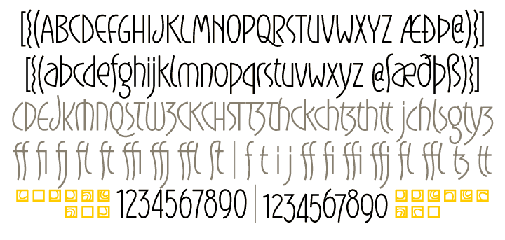
Just released shortened (Latin characters only) version of my font Gaisma.
http://new.myfonts.com/fonts/lamatas/gaisma-latin/

This is pretty nice, Kristians.
The uncial part of it being perhaps the most charming.
Some lovely ligatures, beautiful figures. The 3 is wonderful.
Perhaps I would revise the @ and the æ a little bit. (You surely see why…)
Captured from commoncrawl.org on 20 Apr 2015. original URL