
Hi There
I am working on a logo for the communcations company/agency I am working for and for which I wanted your opinion.
Keywords: proud but simple, embrace (close) and atmosphere
My question: which mark do you think works best?
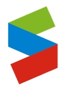
// MARK 1
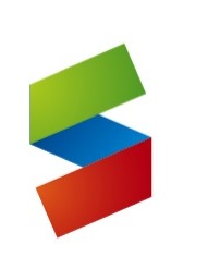
// MARK 2
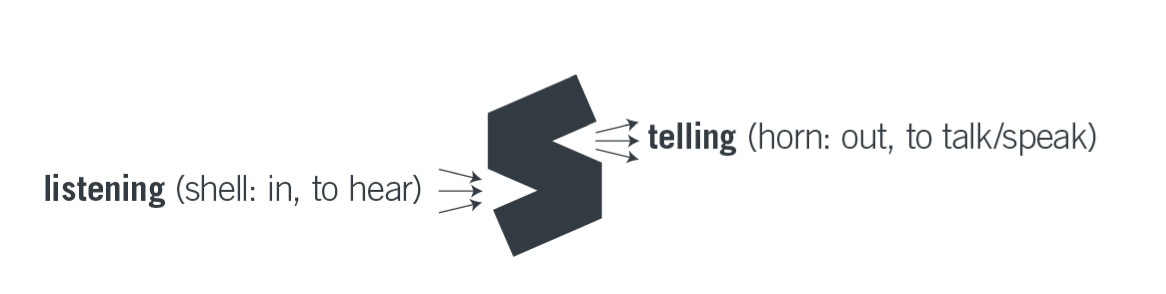
// Concept
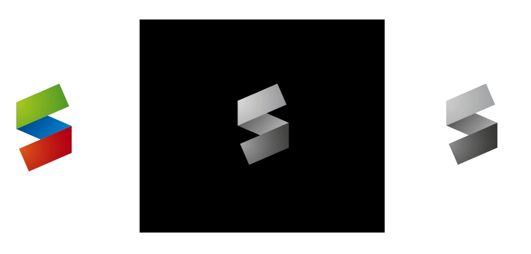
// Variations on mark 2
The S is the first letter of the name of the company.
And the colors were choosen by feeling. Afterwards I noticed these were red, green and blue as in RGB (different order, though).
Would appreciate your comments.
Cheers
Ray


