Hello there , I'm a design student currently working on a project in which I am aiming to create a logo type for placebo medication.
I have hit a wall and would like feedback to help me develop my designs.
I am currently working on a stencil logo type
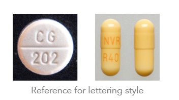
based on the rounded type that is stamped onto pills & capsules (see ref1)
I started with quite a light typeface made of two sections ( to represent the pyschological & physiological aspects of medicine that work together )
My tutor suggested to thicken it up , using the omnipresent helvetica as a reference.
i've tried this but now it just looks (for want of a better phrase) ' sausage-y '
illegible would probably be a more relevant phrase to use, but i'm sure you will understand.
any help or suggestions for further development would be greatly appreciated, thanks
| Attachment | Size |
|---|---|
| ref1.jpg | 59.17 KB |
| placebotester.jpg | 112.69 KB |