
Saw this on a design blog and thought I'd post it here. I'm not associated.
There are some interesting examples of missing diacritics etc..
Saw this on a design blog and thought I'd post it here. I'm not associated.
There are some interesting examples of missing diacritics etc..

Interesting site.
For diacritics lovers, there always is http://www.flickr.com/groups/fancy-diacritics/ too.
Thanks Riccardo. These sites are quite useful to me. I must confess as I can only speak English I don't have a good sense of diacritics, hopefully I can develop some sensitivity to them.
I'm a bit confused by the project though - has the author revised the diacritics in the chosen typefaces?
Aren't diacritics based on understood archetypes and designed to match the general design? There can't be a right and wrong, surely, just a better or worse?
Best practices for designing diacritics could be found here: http://diacritics.typo.cz/
(it seems that diacritics are a big issue in Czech Republic ;-)

There can't be a right and wrong, surely, just a better or worse?
Not even that.
It's a question of standards and conventions.
For instance in many graphic genres it is customary to omit accents on capitals, eg sports kit:

For display caps, I've seen settings where typographers have made up and manually inserted very small accents.
I'm working on a display font with very small cap accents at the moment, but am making it up as I go along, as I'm not aware of any precedent. Which display fonts have very small accents?
That was one of the gripes on the site: Miroslav SATAN v Miroslav ŠATAN for example.
It is a lazy convention rather than a good standard?
Some would say lazy, others expedient—which is often considered a virtue in design.
Perhaps there are some examples in the Flickr group that Riccardo posted.
Some would say lazy, others expedient—which is often considered a virtue in design.
I agree principally, when designing I'm generally happy to omit information that is perhaps unnecessary but isn't this just a matter of spelling? Is a missing diacritic considered to be a spelling mistake? Again, as somebody who can only speak English I'm fascinated by this extra dimension.
Is a missing diacritic considered to be a spelling mistake?
It depends on a lot of factors. And, as Nick pointed out, conventions.
For example, in Italian all caps settings, was/is customary to replace accents with apostrophes, but never to omit them. This is eased by the fact that accents happen only at the end of words and that there are several common words distinguished only by one accent. One glaring example is the difference between "e", which means "and", and "è", which means "is".
Do you have an image of that Riccardo?
(Thanks to both you and Nick, I'm learning!)
First ones I found:
http://upload.wikimedia.org/wikipedia/it/1/17/Vietato_sputare.png
http://www.centromanichini.com/manichini_foto/imgp/2702_targa_latta_viet...
Also, compare these two:
http://www.mondodiholden.altervista.org/userfiles/images/liberta%281%29.jpg
http://www.omelie.org/catechesi2007/imageavv2.jpg

About spelling - for instance that SATAN, proper written as ŠATAN is pronounced as Shatan.

Following a link on that site, I see that the Ogonek is not the only complicated accent in Polish!
Even the kreska - the one that looks like an acute accent - turns out to be tricky.
Adam Twardoch's site is fantastic.

Thanks for the link, Riccardo.
I’d like to add that with Fancy Diacritics, we are looking to collect examples that are unconventional, in one way or another – including solutions that are playful, creative, dated, alternative, rare, only useful in all-caps etc. pp. Some of them are very clever and beautiful, others unfortunate or even atrocious. Those who are looking for a guide how to design proper (text face) diacritics will find better advice on the sites mentioned in the links section.

For instance in many graphic genres it is customary to omit accents on capitals, eg sports kit
This is customary only in U.S., in the Czech Republic, spelling HASEK is not proper (cf. HAŠEK). The only case for omitting accents while writing in capital I know, are grave, acute and circumflex in french – and it does not work with cedilla. In eastern european languages is it not possible (though there are some cases in romanian)
Jan, that's the dominator's Czech national hockey sweater I showed above.
Here's another, from 1998 (I'm assuming that's the Nike swoosh, not an accent :-)
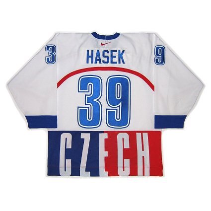

HAH Love the Nike swoosh in that one!

>For instance in many graphic genres it is customary to omit accents on capitals
I've been watching this change here in Quebec over the past few years. Twenty years ago, omitting the capital accents was considered normal, but as computer technology made the lapse more a question of lazyness and not technical expediency- using accents with capitals has become more and more de rigueur.
I posted this http://typophile.com/node/60098 a while ago, compiling a bunch of vernacular ogoneks... if your are interested in variety more than best usage.
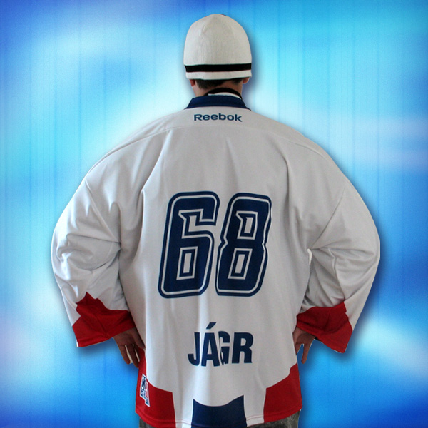
I know, it is not Hašek, but Jágr, nevermind – it could be tolerable in these special cases – it is not a standard, because they re not just accents, but another letters, so the trouble is, that you don't know, how to read it, if you haven't knewn it before.


Valencia in its game against Seville changed all its players names to Japanese.
http://www.valenciacf.com/export/sites/default/contenidos/Galerias/Multi...
ビセンテ

Now I really must say like a certain swordsman drifter: "Oro?"
Captured from commoncrawl.org on 19 Apr 2015. original URL


