
Looking to find what font this is.
Thanks for looking.
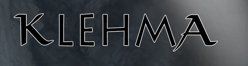
Looking to find what font this is.
Thanks for looking.

K and A: Viking
LEHM: Lithos Pro Regular
Awesome, thanks.
I should have noticed that it was two fonts. I kept thinking the other letters were Lithos but the K and A didn't look right. I was thinking it was a modified version of Lithos done in Illustrator. Didn't catch that it was two fonts. Thanks!
Captured from commoncrawl.org on 21 Apr 2015. original URL