Typophile

Futura alternative for web?

RyanJP

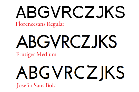
Just wondering if anyone can recommend a good geometric sans-serif that is web licensed? My client insists on Futura, and I'd be interested to know some good, free alternatives.

Also if anyone wants to throw in any good web-font resources that would be pretty awesome too.

Thanks!

Hello Ryan,

Did you check Google Web Fonts' Josefin Sans. "Geometric, elegant and kind of vintage, special for titling. It is based on 1927 Rudolf Koch's Kabel, 1930 Rudolf Wolf's Memphis, 1927(?) Paul Renner's Futura." as described by it's creator, Santiago Orozco.

You should also check Typekit, their pricing is very reasonable and in case if your client doesn't want to pay there is a free plan available, of course with some limitations.

Regards,
SB

Font should never be free! Futura is available for web use, but I'm not sure about the rendering quality at small sizes. Make sure you test it (especially in XP).

thefoxisblack.com uses a free font called Florencesans as a web font for headings, and it looks pretty decent actually.

Garabond, I think by "Frutiger Medium" you meant "Futura Medium"

True.

thanks for the info everyone (even you, sarcastic google guy- jeez what a great resource that is!!) all was very much appreciated

This font is even closer, if you're still looking that is: http://en.wikipedia.org/wiki/Beteckna

VTF Lineal is a kind of Titling Futura, under SIL OFL licence :
http://www.fadebiaye.com/type/lineal/Lineal.otf

From Typoshop ubs: Fabrik (based on Beteckna 0.2) and Jakob may be of use. Uwe's other fonts and faces are neat, too.

Futura PT is available on Adobe TypeKit.

There are also some free web font alternatives for Futura

Hope that helps.

It helps some people, hurts others.

hhp

You mean Futura haters?

:-)
No, I mean suggesting free alternatives hurts people who want to make money making type (with Typophile being the closest thing such people have to a watering hole).

hhp

Oh, that! Well, I had no intention of doing that.

A lot of people are happy with free options, or just can't afford it. But I do think anyone who is willing and able to pay is going to get a better result.

Just in regards to this thread, if the client has the money I imagine they will just get Futura, otherwise at least they have some options. OP did say they wanted free options.

So if I start a thread asking for a good source for child porn, would you help me out? What if I do it on a website for mothers of victims of sexual abuse? Admittedly this isn't as bad, but it's bad enough.

Yes, pretty much everybody -including clients mind you- likes free/cheap stuff. But many people don't think about the long-term consequences. And if I were a betting man I would bet that most people who claim they "can't afford it" spend more each month on their cellphone bill just so they can talk/text vapid junk to people they don't even care about.

hhp

I take your point, but should we conspire to hide information that is out there?

If there is a free solution that might suit the requester, and we know this but conceal the fact in order to motivate them to pay money for an equivalent solution, where does that put us ethically? And if the requester paid money (perhaps to one of "us") for a solution, and then discovered that (by their initial criteria, at least) it hadn't been necessary, and that we'd deliberately kept that knowledge back, what would (s)he think of us then?

Is it not better to earn our* pay by pointing out why our work is better than the free stuff? Or, possibly, why the free stuff is morally inferior (if it is)?

Not sure I know the answer to these questions, but I figure they're worth asking.

(* "our" is used rhetorically here)

Wow, seriously? Moving along...

altsan, as a freelance Web designer & developer of over ten years, I've always provided my clients with the best solution for their needs. That includes free alternatives to my paid services. I consider it the only honest thing to do, as my clients come to me for my expertise. While it might cost me the occasional job, it earns me long-term clients and steady business. So yes, I would agree that it is better to earn our pay by showing why it is better. That said, sometimes the free option *is* better, and I'm never going to mislead a client just because I want to earn a buck.

Alex, those are very good questions.

I don't recommend tricking people*, and I don't blindly advocate something simply because it benefits a certain group of people. I try to consider things case-by-case. In this case, when I read "My client insists on Futura" but a free alternative is sought, there's clearly a lack of proper valuation of type. Either the client should pay for the font they so badly want (which is actually the norm) or the designer has to absorb the cost. What seems to be happening instead is the designer hoping to con the client so nobody has to pay for the real thing. But yes, we do constantly have to demonstrate why quality costs money**. That comes with the territory.

* When a regular Joe asks me how to simply type in Armenian on their computer, I don't try to sell them a font; I point them to Arasan (warning them that it's not Unicode) or this: http://www.tinyurl.com/unicodearmenian

** As I said recently: when it doesn't, watch your back...

hhp

@hrant, Thanks for pointing out nuances I hadn't quite picked up.

To clarify where my mentality comes from, one of my long-standing pet peeves is people who thoughtlessly use the default fonts (mostly Times and Arial) for everything without even thinking. I don't deal with graphic designers or marketers, but rather with everyday professionals who need to knock together a document or presentation. I try to encourage and educate people like that to make more intelligent & professional-looking use of fonts. So in a way, I'm actually in the habit of seeing it in peoples' best interests to tell them where they can find legitimate, quality fonts when there's no budget for purchases. Libertine and various other open source fonts are common recommendations of mine. (I'm currently rewriting a product user manual; one of my very first alterations was to change it from all Times New Roman to Libertine and Utopia, which are certainly more readable at the size they're using.)

I must say that coming to Typophile has exposed me to some interesting alternate perspectives.

tell them where they can find legitimate, quality fonts when there's no budget for purchases.

That sounds like an ideal "ice-breaker". The hope being -at least for me- that once you've nicely implanted a sensitivity that takes them beyond their default choices, some of them will go on to valuate type design, or at least the resultant fonts.

hhp

Glad you think so. :)

Incidentally, my opening line to WinXP users when they tell me they're stuck with the pre-installed fonts is "Just try one thing: change the default Word font to Palatino and see the difference it makes."

Font should never be free!

That's a bit extreme. There are many many factors that can determine the price of Fonts (or any other physical or digital object). And, under many circumstances, releasing fonts (or any other physical or digital object) for free makes perfect sense.

Agreed. Especially when a benevolent organization pays a designer to make a font to distribute for free (as happened with me with Arasan). HOWEVER: I still do feel in most cases it's a bad idea (although not always for the same reasons).

hhp

LATO is actually the most similar Google font to Gill Sans. I've spent hours looking through them to find the best match. It creates a sentence of the exact same length so you don't have to worry about it wrapping prematurely. I have font samples to prove it: http://joelcrawfordsmith.com/new/font/gill-sans Some Google fonts look terrible in IE8. This font also works in IE8.

It creates a sentence of the exact same length [as Gill Sans]

Really? I wonder why they don't tout that feature.

hhp

Chances are nobody noticed it.

The designer didn't notice it?
Note that Joel did say "exactly".

hhp

Exactly to which Futura in particular?
There are lots of digital versions of Futuras by different Foundries, and they all seem to have different metrics :)

Also, when you say 'Exactly' are you meaning:
1) Exactly like in 'almost the same' judging by eye?
2) or Exactly like 100% the same 'advance width' and 'kerning pairs' across all the range of weights? (that will be fully metric-compatible, other way will be 'pretty close' but not 'Exactly')

My initial guess is that Ryan is using the term 'Exactly' as in 1) meaning.

You might be right. The thing is, if you're close enough to be "almost the same", you might as well make it exactly and "sell" that feature.

hhp

'Almost the same' can be a happy coincidence.. or even an intended coincidence.
But it's not enough to 'sell the feature' because it will still cause document re-flow.

'Exactly the same' to avoid re-flow, on the other hand, will require having (licensed?) access to the original metrics/kerning. Although metrics-compatible fonts seems to be a pretty usual practice for compatibility reasons, as discussed here: http://typophile.com/node/90341

If it's an "almost" it's not "happy". If it's unintended it's OK, since we can't expect people to be psychic. But if it's intentionally "almost" (which seems unlikely) that's just dumb.

Concerning whether copying metrics is legal and/or ethical, that thread actually convinced me it's enough of both of those things to be OK. I'm not sure you'd even have to buy a copy of the original, although ethically it would be better.

hhp

Captured from web.archive.org on 6 Mar 2015. view this capture